
Mozak Innovative
Logo, brand identity, web design and WordPress development for an engineering company presenting solar, signage, tracking and access-control solutions.
- Client
- Mozak Innovative
- Year
- 2023
- Role
- Logo & Brand Identity Designer, Digital Art Director, Web Designer, Frontend & WordPress Developer
- Disciplines
- Art Direction, Backend Development, Brand Identity, Frontend Development, Web Design
- Live site
- mozakinv.cl (opens in a new tab)
My contribution
- Visual design
- Lead designer
- Front-end
- Lead developer
- Back-end & systems
- Lead developer
Brand Identity · Art Direction · Web Design · Frontend & WordPress Development
I created the Mozak Innovative logo from scratch, designed the corporate visual identity and carried it into the website: the art direction of imagery and icons, the website design proposals, the frontend development and the WordPress implementation.
01 · Context
Designing for a technical audience.
Mozak Innovative develops engineering and technology solutions for industrial and energy-related applications. Its website presents four product families: a modular solar power plant, instruction gantries for roads and blasting areas, real-time personnel tracking and autonomous access control.
Each family comes with its own technical vocabulary — installed capacity, connectivity, autonomy, sensors and cameras. With products this different, a consistent visual language and a predictable product structure are what let them read as one company.
02 · Brand identity
Establishing a visual foundation.
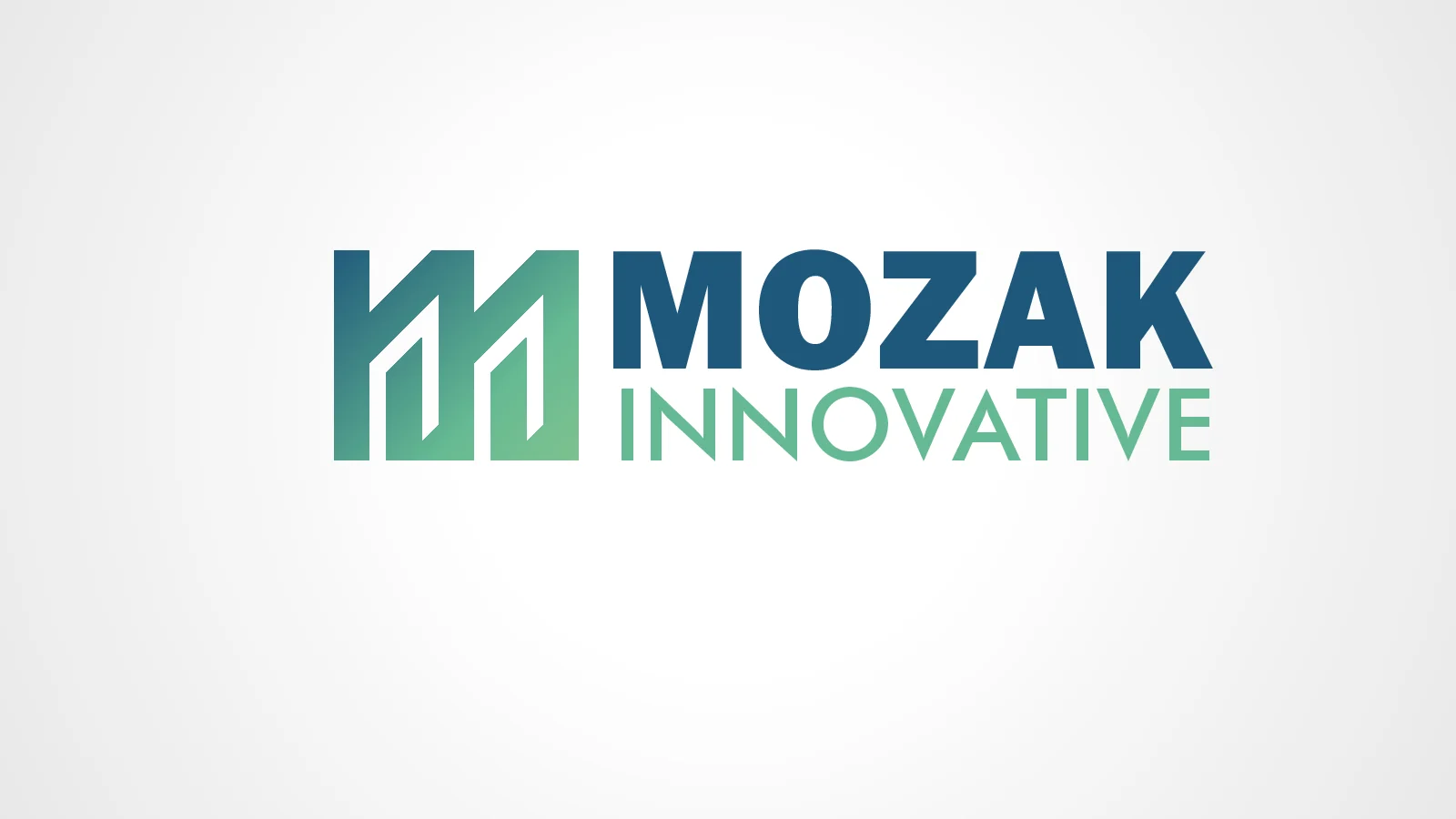
I designed the Mozak Innovative logo from scratch and built the corporate identity around it. The exploration file documents four routes for the symbol; the approved logo develops the first, drawing the M from rounded strokes that fold over one another, with a gradient that runs from light green to the corporate blue.
Beside the symbol, the MOZAK wordmark is set in Bebas Neue in blue, above the widely spaced INNOVATIVE descriptor in Finance, in green. The identity was delivered as a horizontal lockup in colour, greyscale, black and negative versions, and its colours, type and rounded forms became the basis of the website design.
Delivered versions
-
Colour version. -
Black version. -
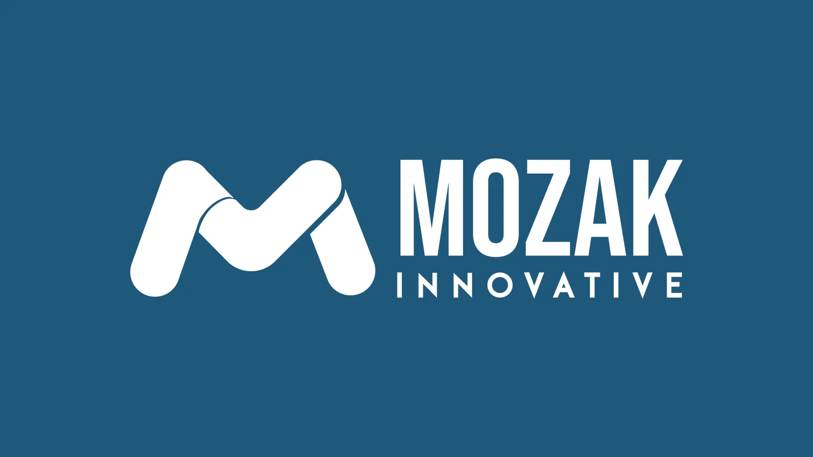
Negative version, shown on the corporate blue.
Identity exploration · July 2023
-
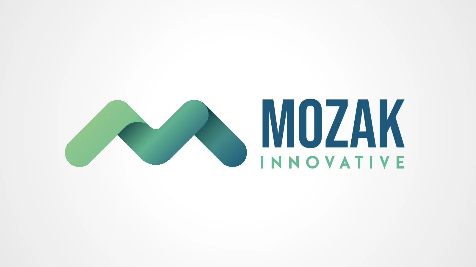
Route 1 — folded, rounded strokes. The approved logo develops this route with steeper outer strokes. -
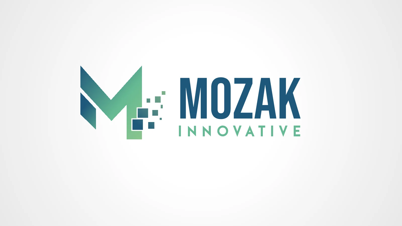
Route 2 — an M that breaks into pixel squares. -
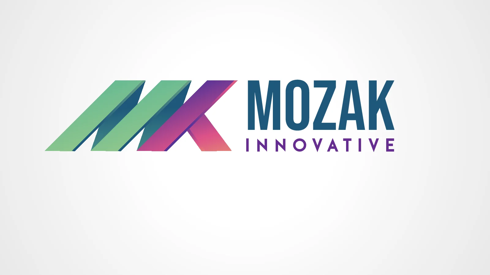
Route 3 — slanted parallel bars with a magenta and purple accent. -
Route 4 — an angular monogram with a heavier wordmark.
03 · Digital art direction
Translating identity into a visual language.
On the website, the identity becomes a working system. Section headings use condensed capitals split into the logo’s blue and green, and the same two colours fill the product cards. Light grey and pale green-grey bands separate one section from the next.
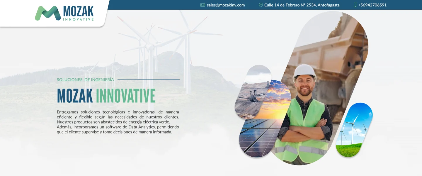
The rounded strokes of the mark are echoed in pill-shaped and organic image containers: photographs of engineers, mining sites and renewable energy are cut into these shapes and layered with cut-out product images. Each product family is described with thin-line technical icons in the brand green.
Colour and type from the logo files
Logo palette
Symbol gradient, wordmark and descriptor.
-
Blue · wordmark
#1E577B -
Green · descriptor
#66BA93 -
Light green · gradient
#91C78D
Hex values from the delivered logo SVG. Typefaces in the original logo file: Bebas Neue (MOZAK) and Finance (INNOVATIVE).
The language in use
-
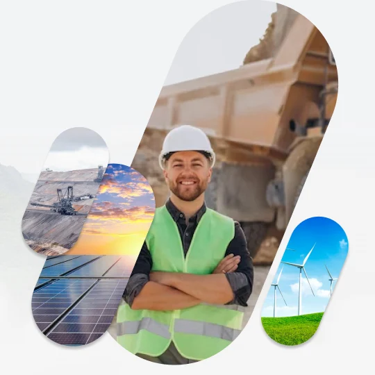
Pill-shaped containers layering photography in the opening composition. -
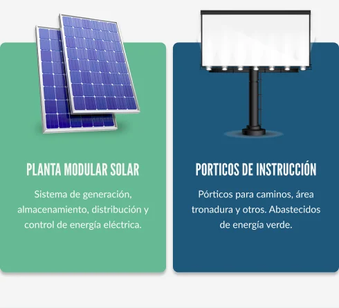
Product cards in the two corporate colours, with product images breaking the card edge. -
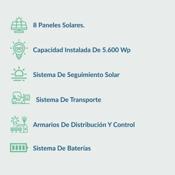
Thin-line technical icons for product features (mobile proposal).
04 · Website experience
Organizing complex information.
The page moves from a corporate introduction to an overview of the four product families, gives each family its own section, and closes with a single contact call to action.
Every product section repeats the same structure: a two-colour heading, a one-line descriptor, a layered image composition and a grid of icon-led features. The image changes sides from one section to the next, so the rhythm varies while the reading pattern stays the same from product to product.
Desktop proposal, section by section
-
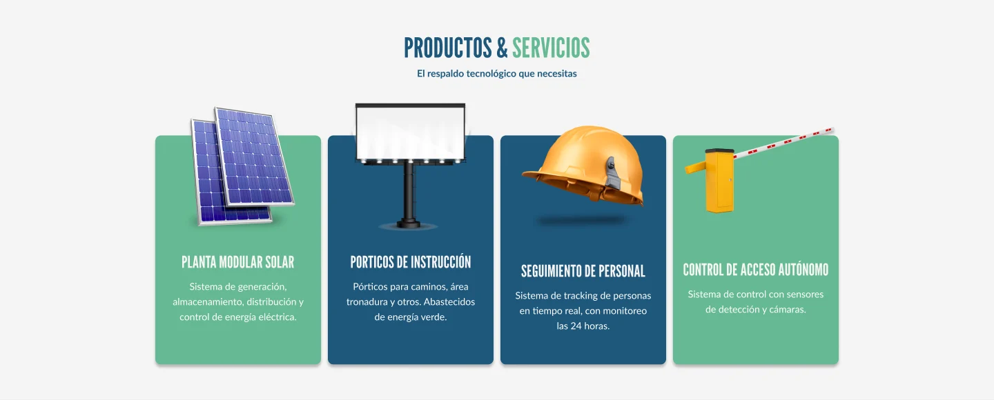
Products & services — the four families as cards. -
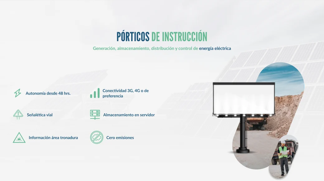
Instruction gantries — features left, image right. -
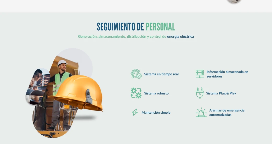
Personnel tracking — the image returns to the left. -
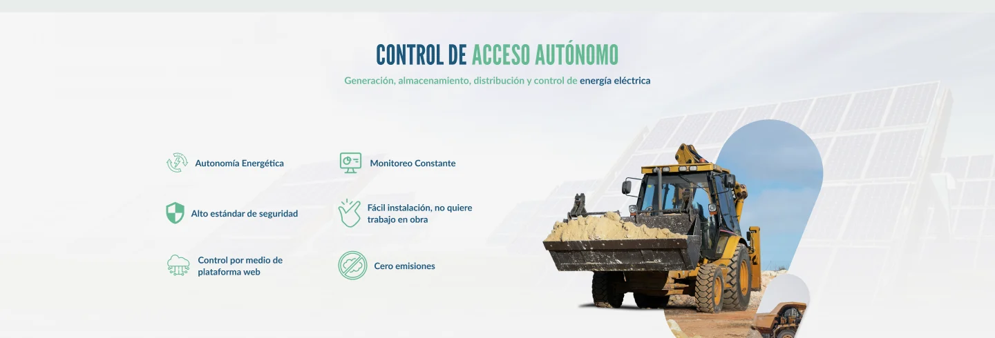
Autonomous access control — the same structure, mirrored again. -
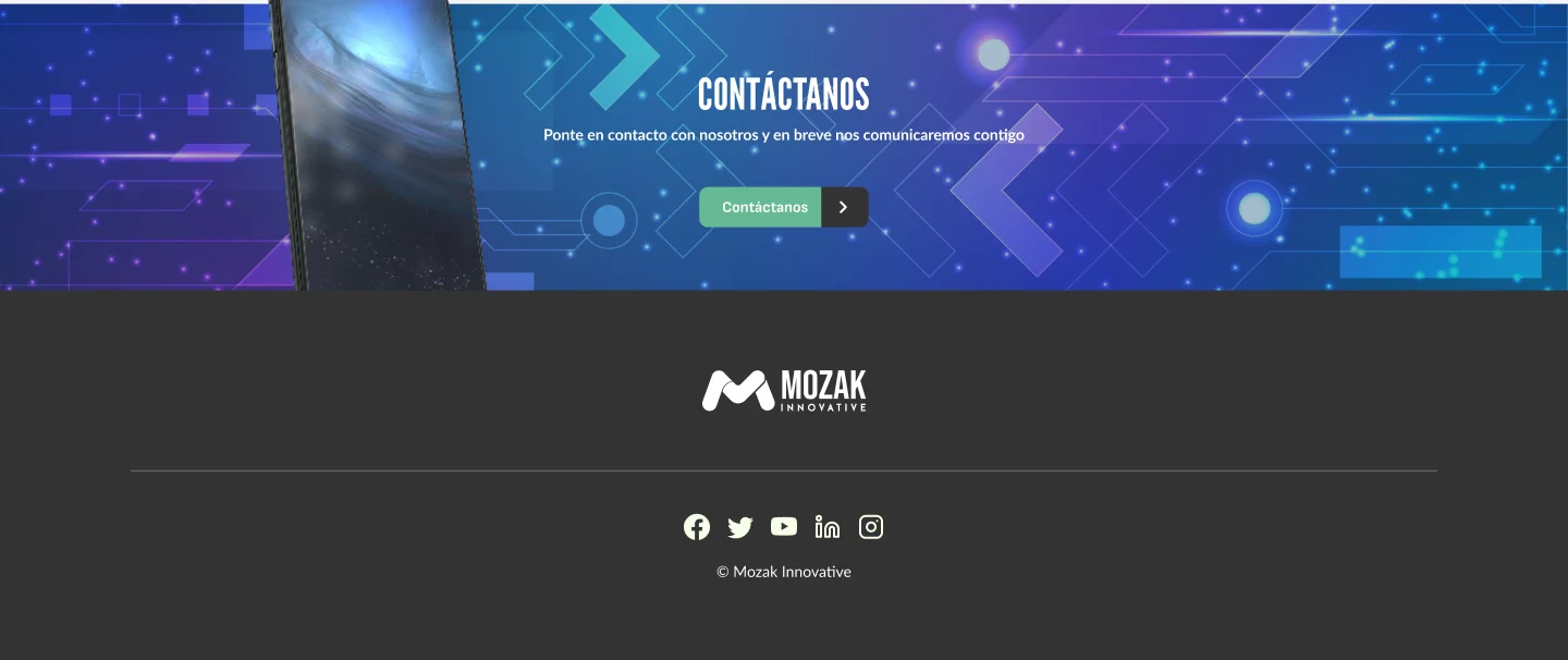
Contact call to action and footer.
05 · Design proposals
Exploring different digital directions.
The project included different website design proposals, exploring alternative ways to organize technical information, product imagery and visual hierarchy.
These screenshots document distinct design directions rather than a direct desktop-to-mobile comparison of the same version.
Desktop proposal and mobile proposal
-
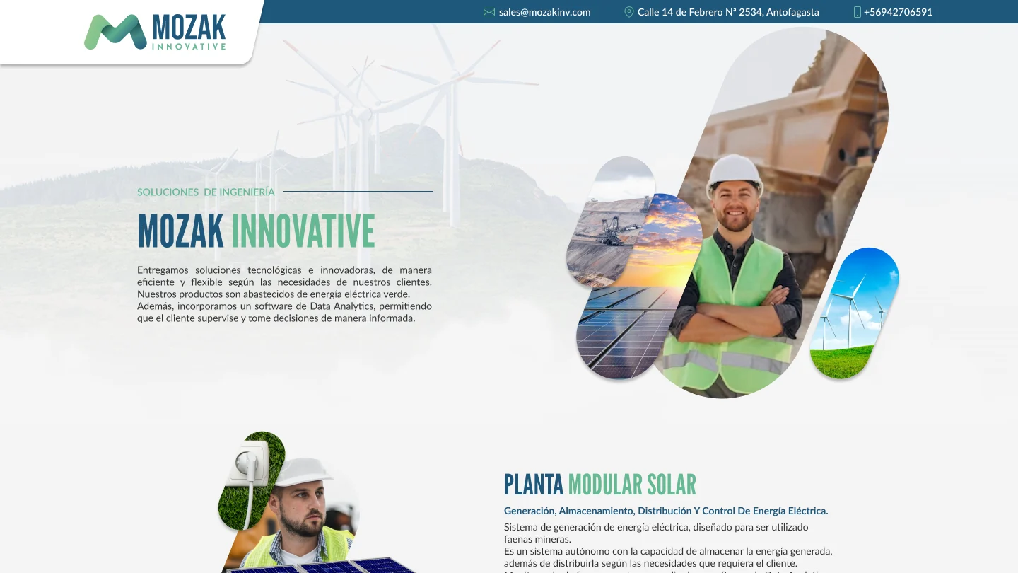
Desktop proposal — opening section. -
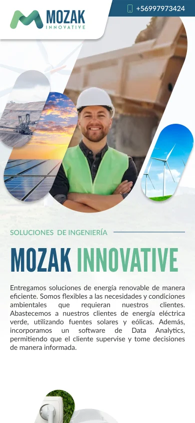
Mobile proposal — opening section. -
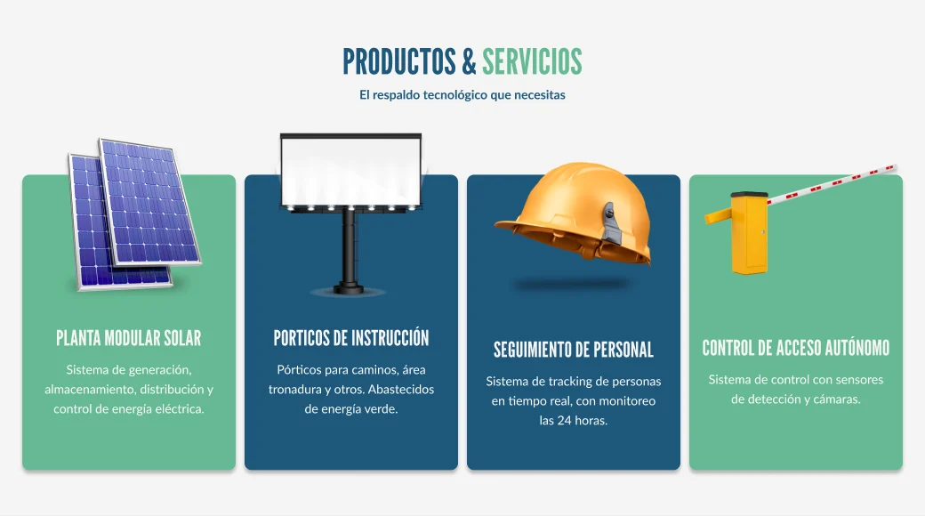
Desktop proposal — the four product families as a row of cards. -
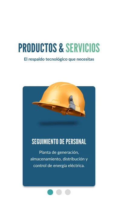
Mobile proposal — product cards shown one at a time, with pagination. -
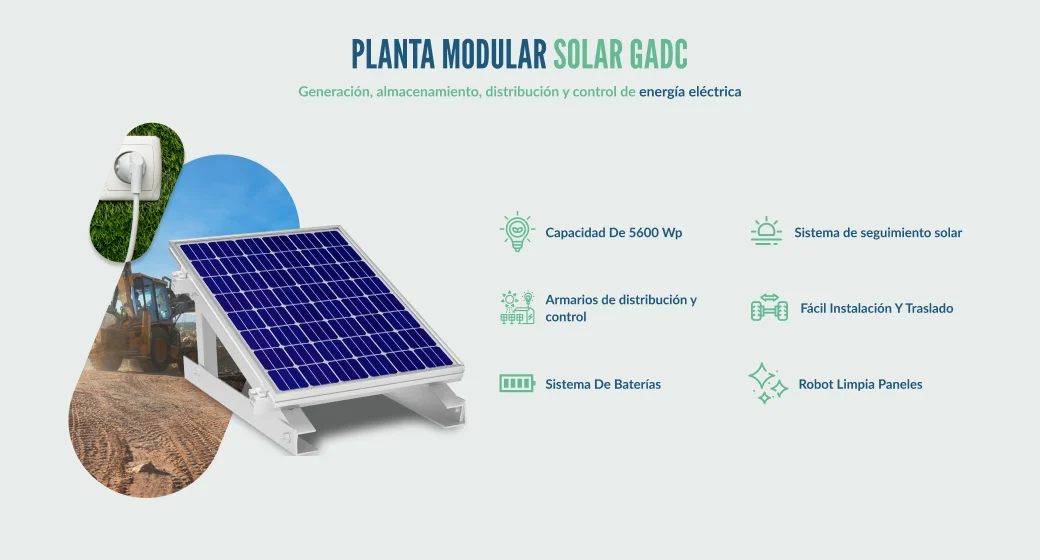
Desktop proposal — modular solar plant section, image beside a two-column feature grid. -
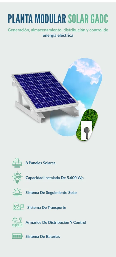
Mobile proposal — modular solar plant section in a single column, with its own feature list.
06 · Implementation
From visual design to a working website.
Beyond creating the brand identity and website design, I developed the frontend and implemented the website in WordPress, translating the visual direction into a functional digital experience.
The website is live at mozakinv.cl. The project’s production files include the logo as SVG for the header and footer, the pill-shaped image compositions exported as separate images, and an SVG icon set for each of the four product families.
07 · Project summary
A connected brand experience.
Mozak’s identity and website share one visual language. The colours, condensed capitals and rounded forms of the logo carry through every section of the site, while a repeated section structure lets four very different technologies sit side by side as one company.
The identity defines the language; the website puts it to work.