
Concept exploration & functional prototype — not launched
LĒVO Oil
Beyond the Machine — reimagining the shopping experience through product storytelling, thoughtful UX, and a design-led approach to e-commerce.
- Client
- LĒVO Oil
- Year
- 2026
- Role
- Art Direction, UX/UI Design, Shopify Prototyping
Introduction
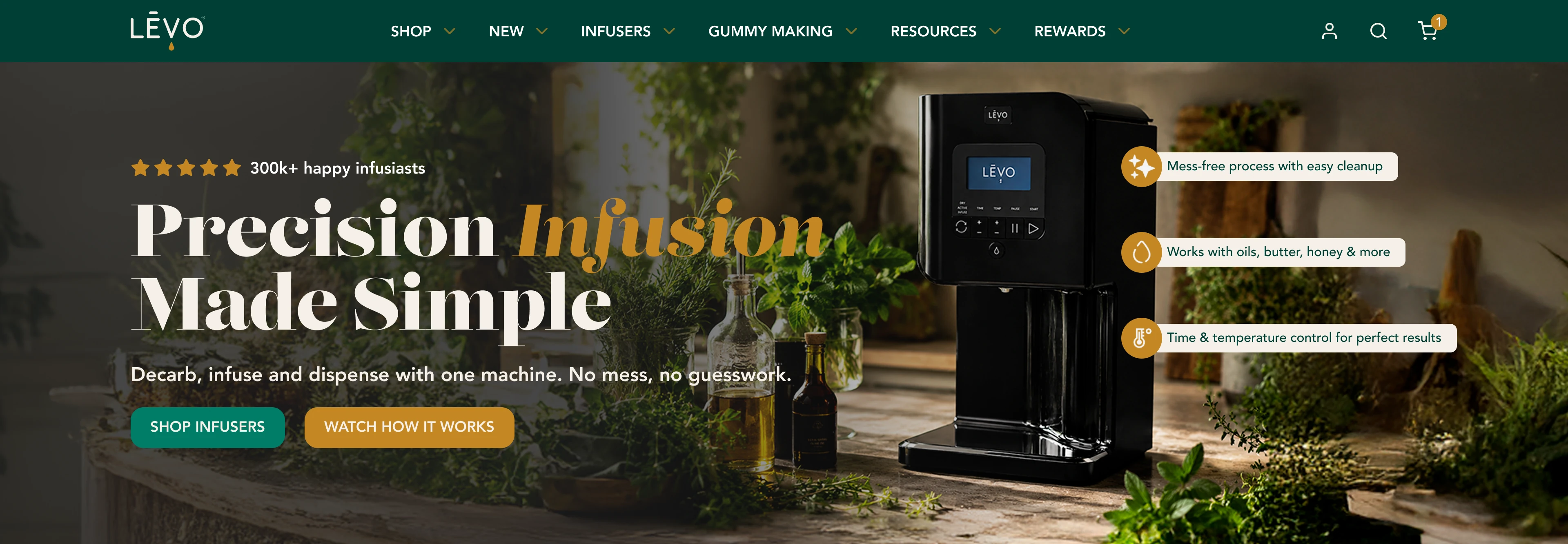
LĒVO Oil makes countertop machines that dry, decarb and infuse herbs into oils, butters, honey and more. Working within the brand’s established identity, I developed a new visual and UX direction for its online store — homepage and collection page, desktop and mobile — and carried the homepage into a functional Shopify prototype. The full redesign was not launched.
My contribution
- Visual design
- Lead designer
Concept, art direction and UX/UI design for desktop and mobile, and a Shopify prototype of the homepage. The logo, colors, typography, product photography and navigation structure belong to the brand; the contextual machine scenes were generated with AI under my art direction.
With Developed for a client of The Limitless Agency
01 · The challenge
More than a spec sheet.
LĒVO’s promise is technical: precise time and temperature control in place of a messy stovetop process. A promise like that is easy to present as a list of features — and harder to make inviting.
The catalog adds a second layer: three infusers, a gummy mixer, ingredients, accessories and bundles. Shoppers need help choosing as much as they need persuading.
I began with a UX/UI evaluation of the store’s key templates. It pointed to specific opportunities — steps that should read as a sequence, purchase actions where products are browsed, consistent alignment in collection layouts — and to a broader one: showing what the machines make possible.
02 · The creative idea
Show the possibilities, not just the appliance.
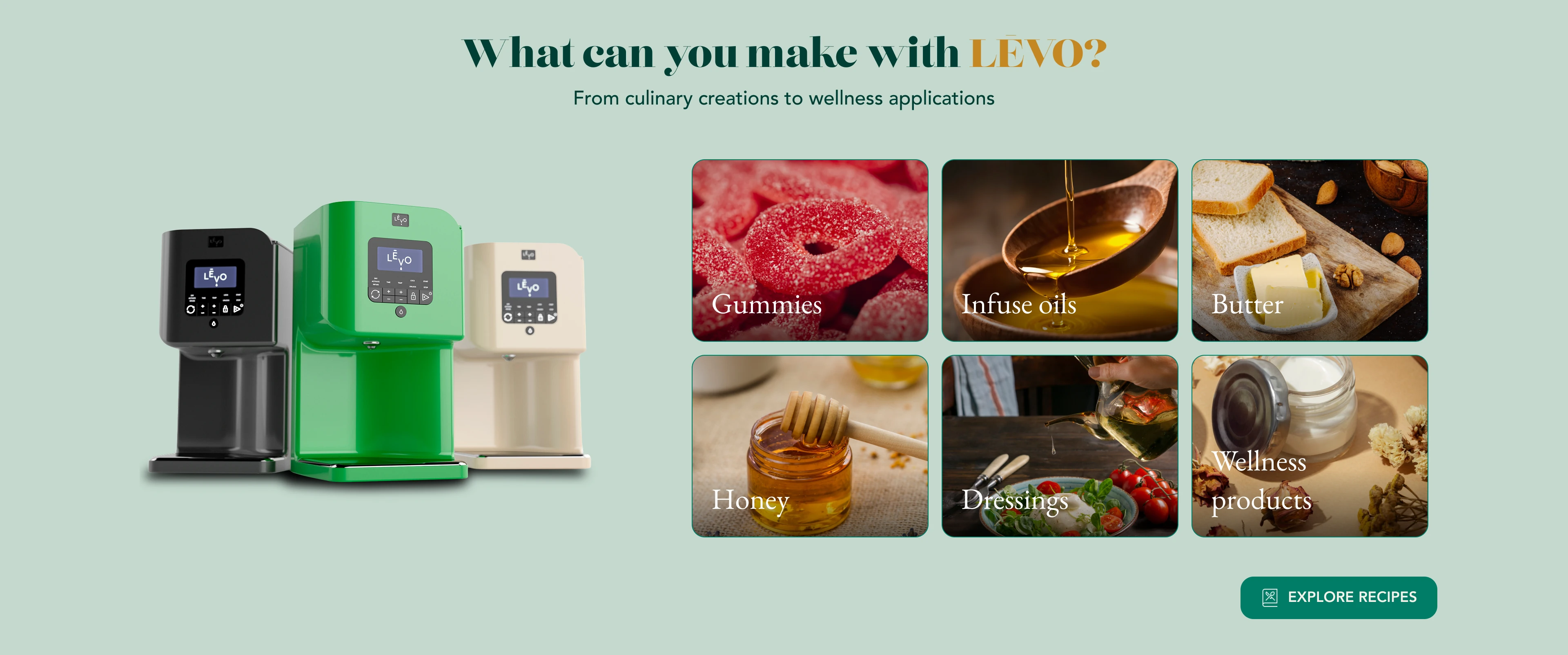
People don’t buy an infuser for the machine. They buy it for the honey, the gummies, the butter and the oils they want to make.
So the direction connects every machine to what goes into it and what comes out of it — ingredients, preparations and the kitchen where it happens. The product stays sharp and recognizable; the context around it changes what it means.
03 · Art direction
Warm, layered, product first.
The identity was given — Lust Didone for display, EB Garamond for editorial labels, Avenir for the interface, and a palette of Forest, Leaf, Parchment and Amber. My decisions were about proportion and composition.
- Parchment as the ground. A warm base instead of white or deep green brings the store closer to a kitchen than a catalog. Forest and a soft sage pace the sections; Amber is kept for one word per headline, the icons and secondary actions.
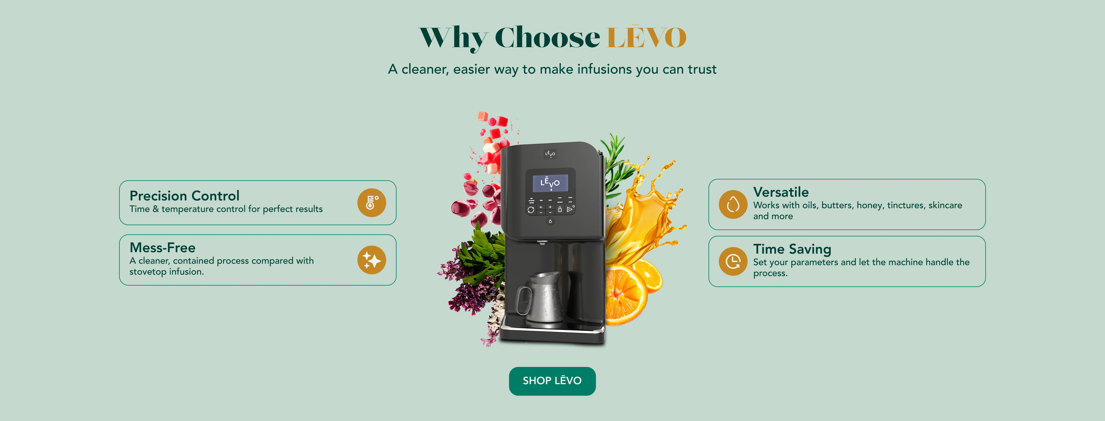
- The machine at the center of what it transforms. In “Why Choose LĒVO,” the product is surrounded by what it makes, with two benefits on each side — the image makes the case and the text confirms it.
- Expressive imagery, structured information. Lifestyle scenes carry the mood; benefits, steps and specifications sit in calm, consistent cards with one icon style.
- AI as a production tool. I generated the kitchen scenes around the machines to a defined brief, then selected, edited and integrated them to sit naturally beside the brand’s product photography.
From product to possibility.
-
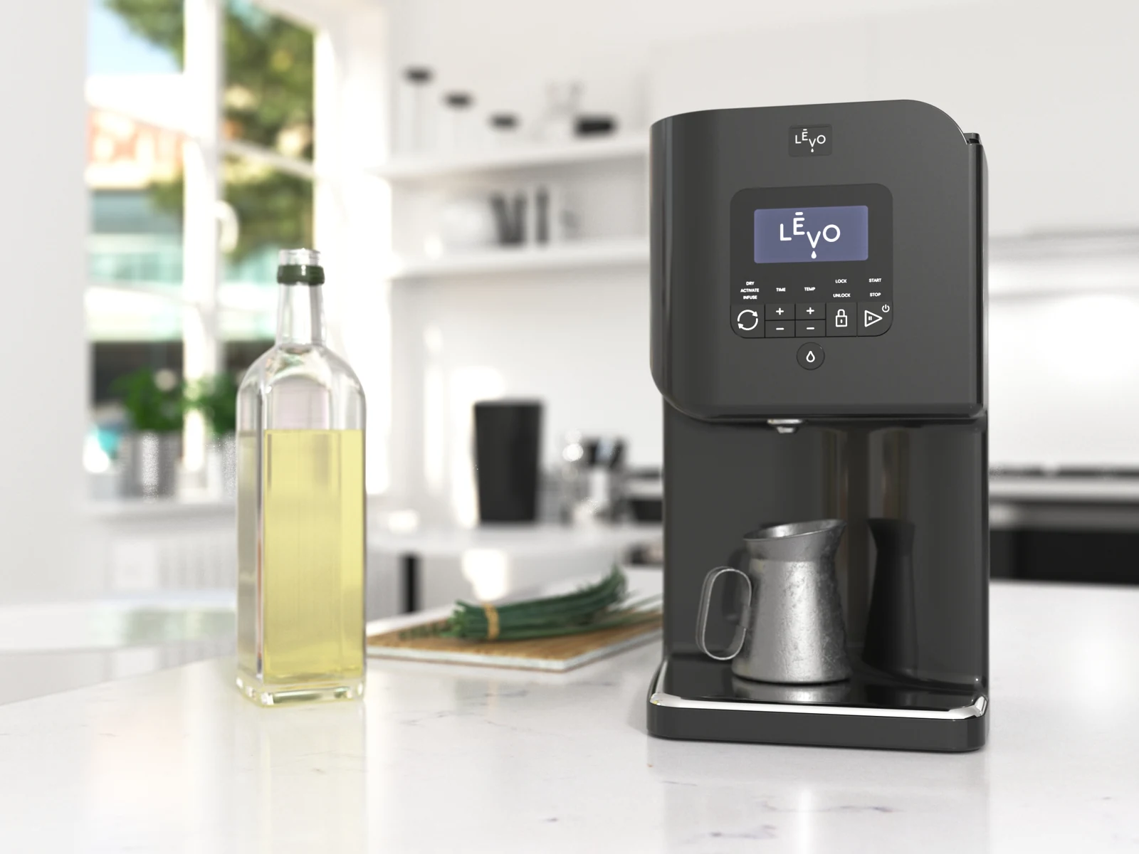
The brand’s product image, as supplied. -
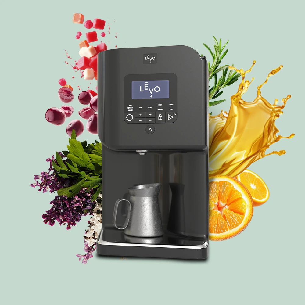
The finished composition. The machine, cut out and re-seated with shadows, surrounded by what it transforms — gummies, berries, herbs, citrus and an oil splash, assembled in Photoshop from stock elements.
The brand’s palette, in new proportions.
Brand core
Provided by LĒVO. Parchment as the ground, Forest for structure, Leaf for primary actions, Amber as a single accent.
-
Parchment
#F5F0E8 -
Forest
#004035 -
Leaf
#007D66 -
Amber
#C48824
Section grounds
Used in the proposal, outside the core palette, to pace the page: sage for products and possibilities, sand for the process.
-
Sage
#C4D9CE -
Sand
#EBDBC1
Hex values from the Figma file.
04 · Designing for confident choices
From curiosity to the right machine.
Once the store invites people in, it has to help them decide. I organized the homepage around the questions a shopper is likely to ask — what is it, why this one, how does it work, what can I make, which machine — and gave each answer its own module.
The catalog at a glance.
-
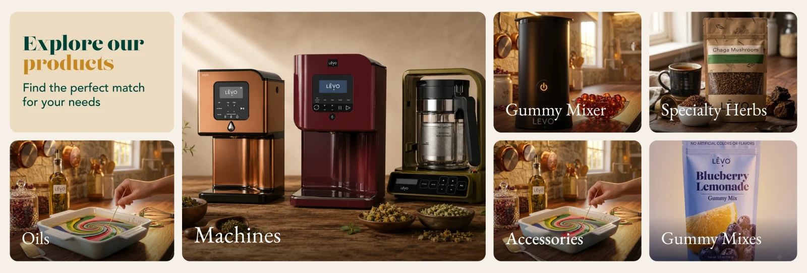
Machines gets the largest tile; mixers, herbs, oils, accessories and gummy mixes are grouped around it.
A process, in order.
-
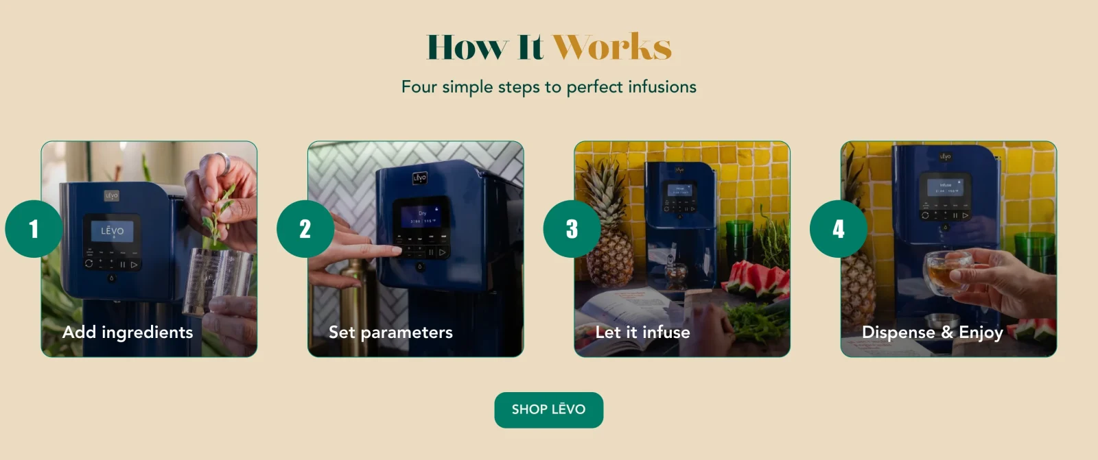
Four numbered steps, so the process reads as a sequence rather than a gallery.
Choosing a machine.
-
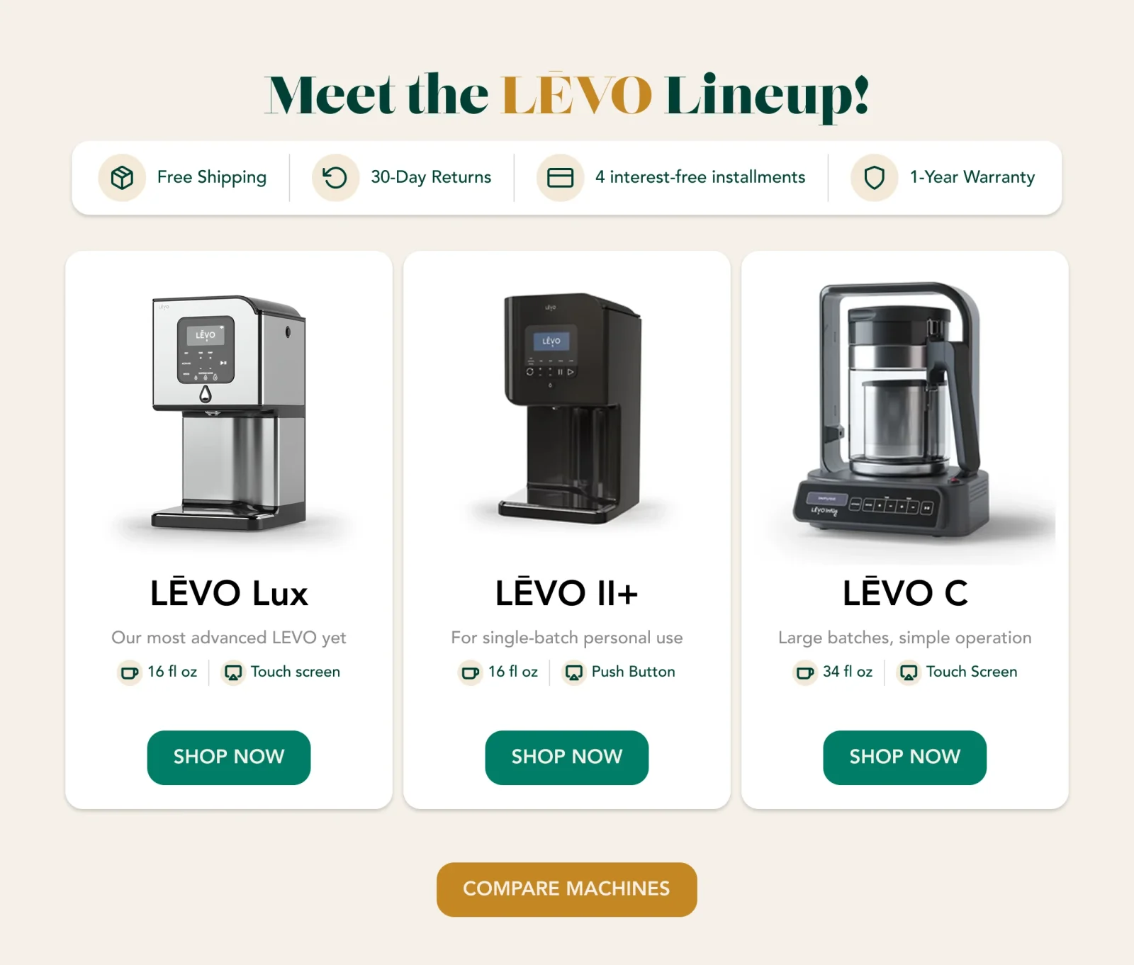
The three infusers side by side, each with a one-line positioning and the same two specs — capacity and controls — leading to the brand’s existing comparison page.
Collection page
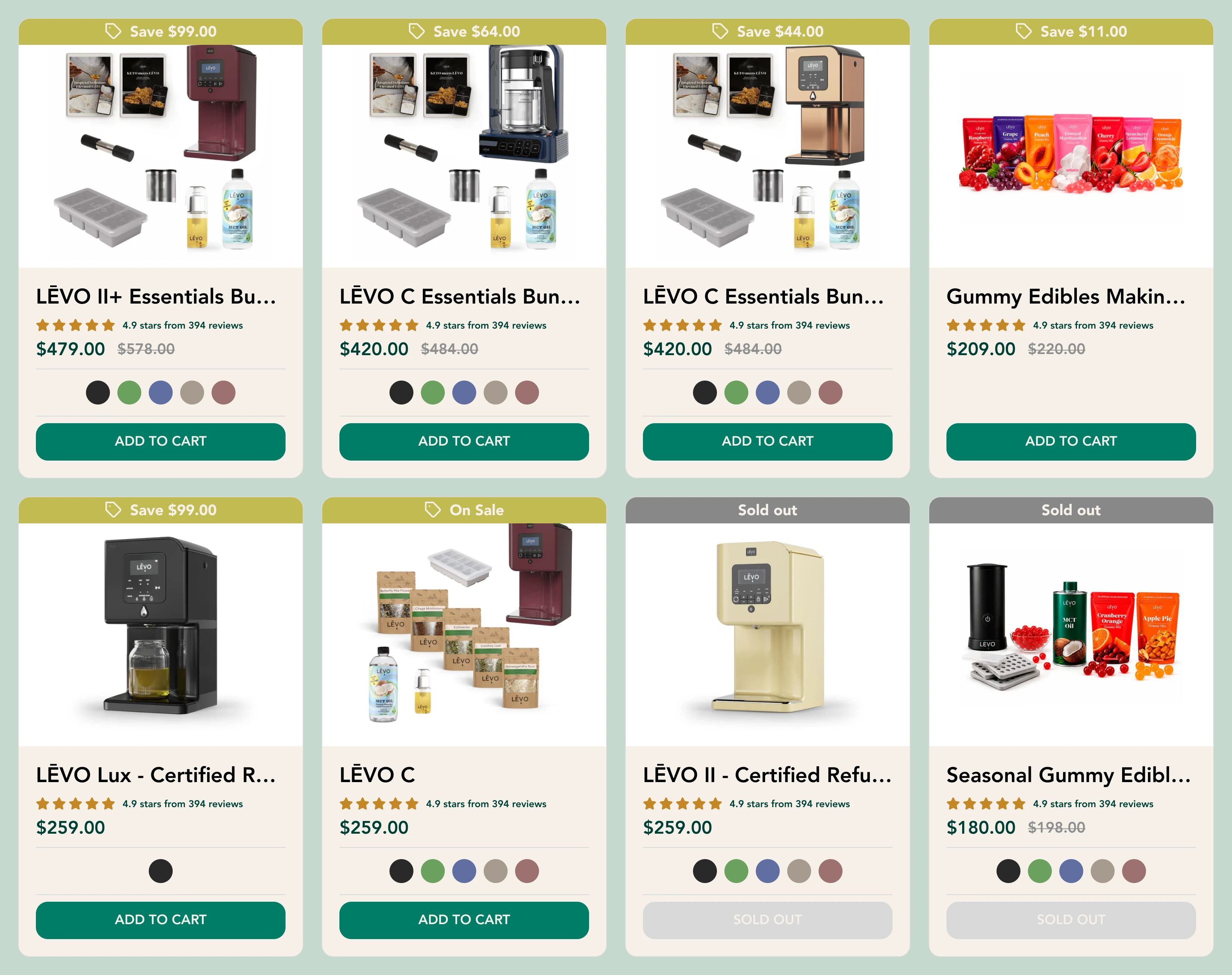
Every card in the same order.
Image, name, rating, price, colors, Add to Cart. Savings and sold-out labels sit as ribbons above the image, so they never push the price aside — and an unavailable product keeps its place in the grid, with its action disabled rather than removed.
Navigation in the same system.
-
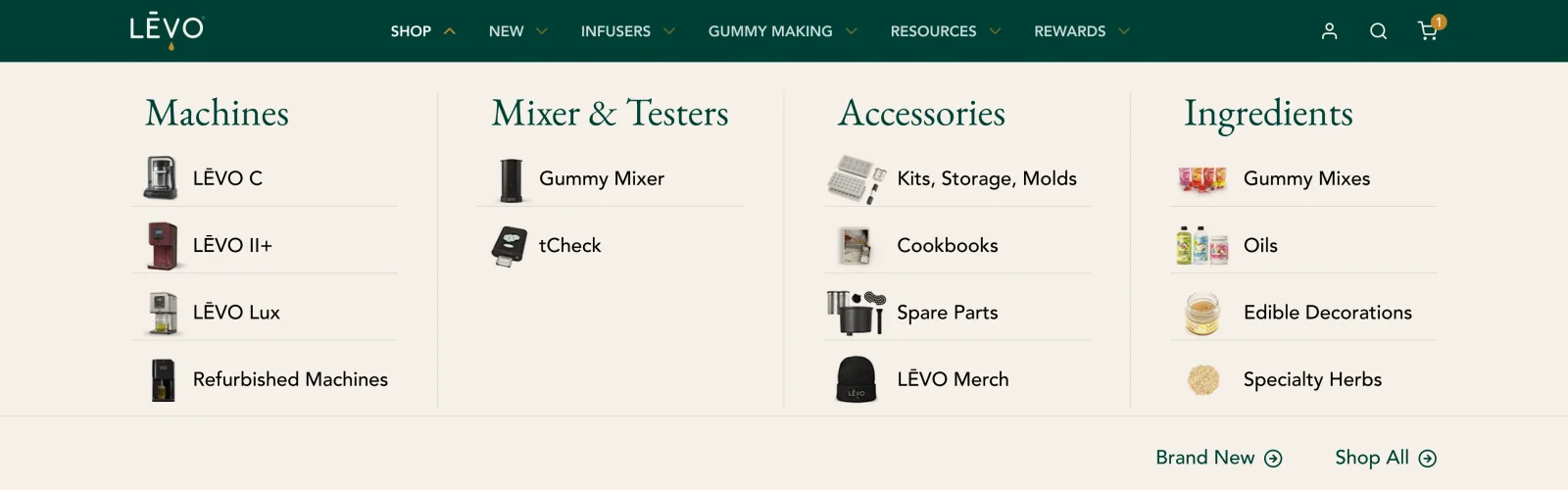
The Shop menu — one of six menu states designed for the header. The menu structure is the store’s own; the proposal brings it into the new visual system.
05 · Across screens
Recomposed, not reduced.
Each section was rethought for a narrow screen rather than scaled down. Three equivalent views show how the hierarchy holds.
First screen: the promise, then the product.
-
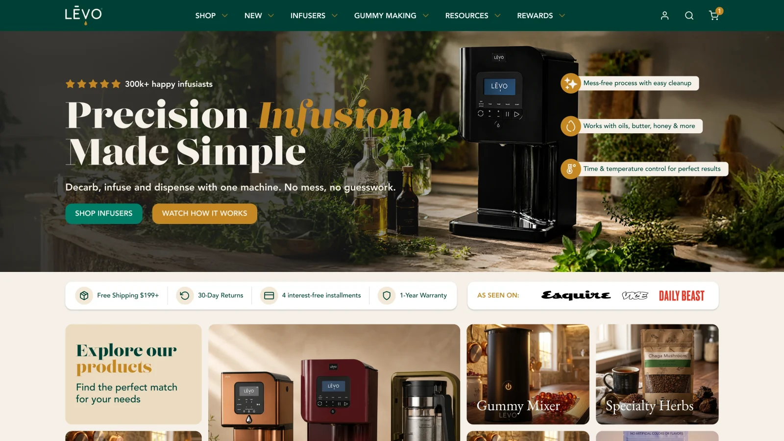
Desktop — headline and actions beside the machine and its callouts. -
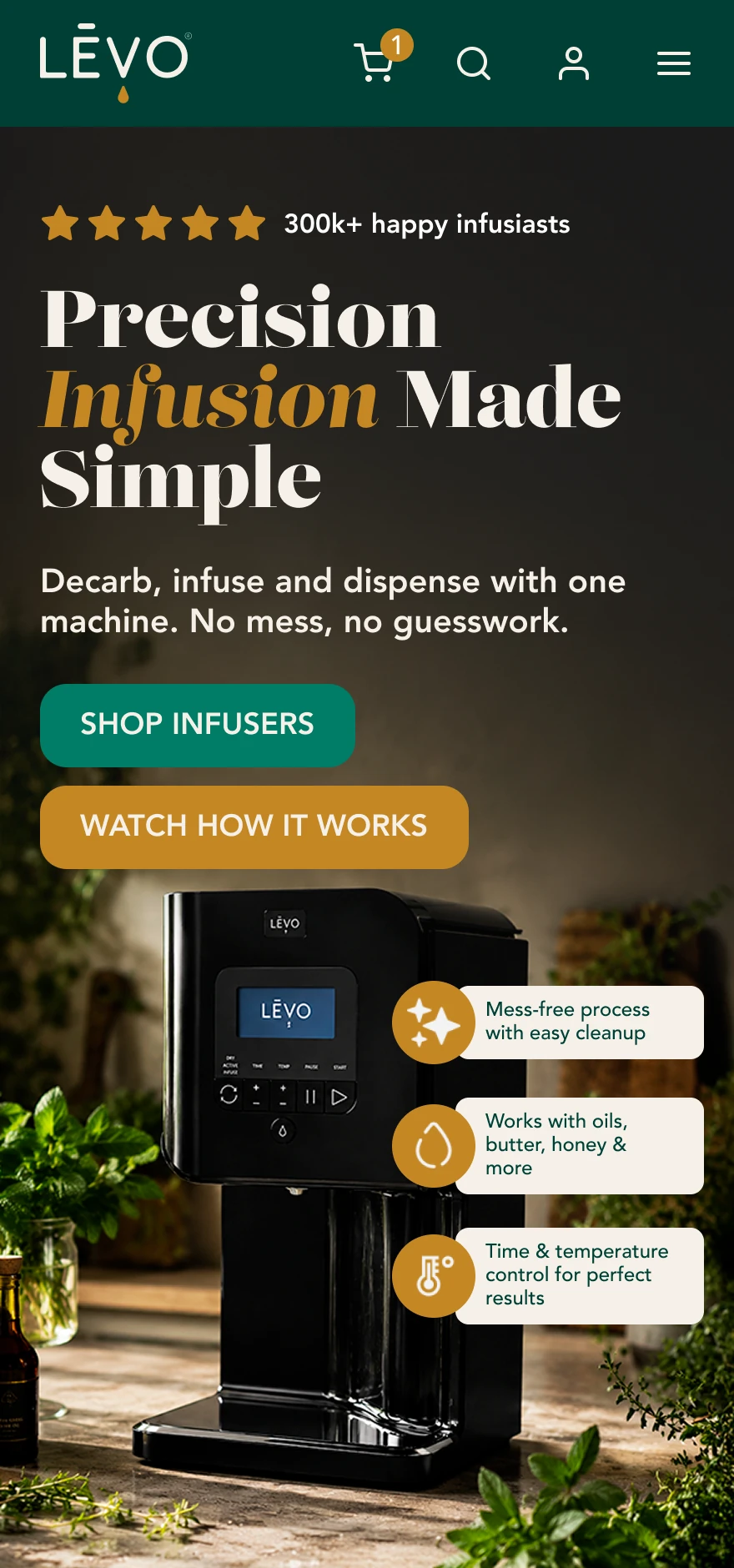
Mobile — headline and both actions first; the machine follows, its callouts stacked beside it.
Collection: one product per row.
-
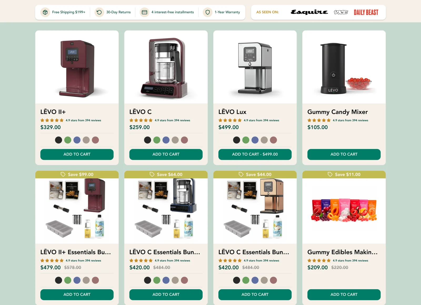
Desktop — four cards per row under the trust strip. -
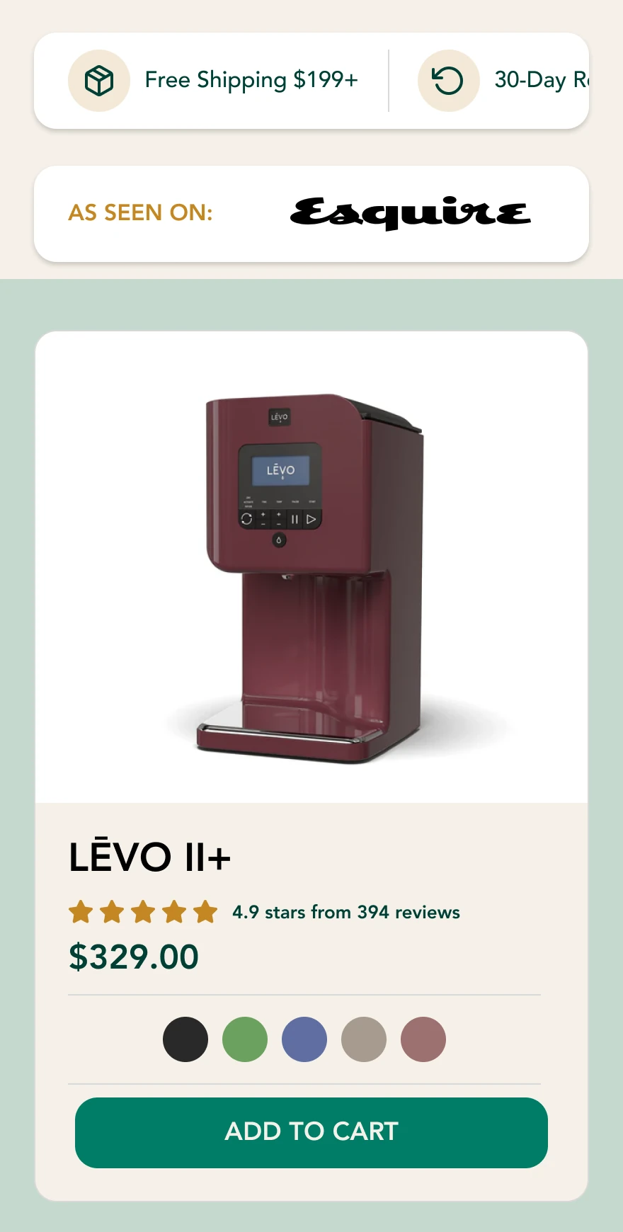
Mobile — one card per row keeps colors and Add to Cart easy to tap; the trust strip scrolls and the press mention gets its own card.
Why Choose LĒVO: the composition stays whole.
-
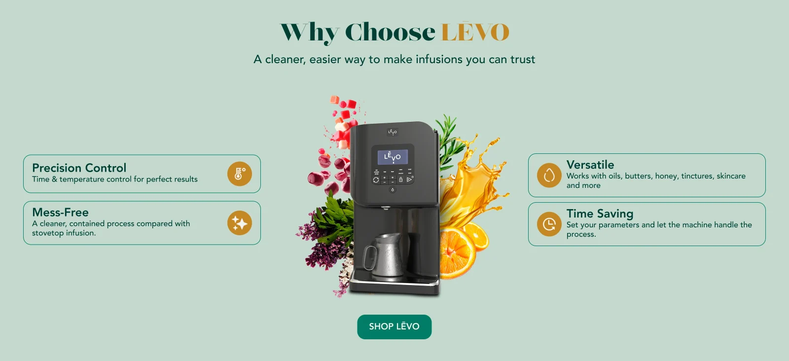
Desktop — the composition at the center, benefits on both sides. -
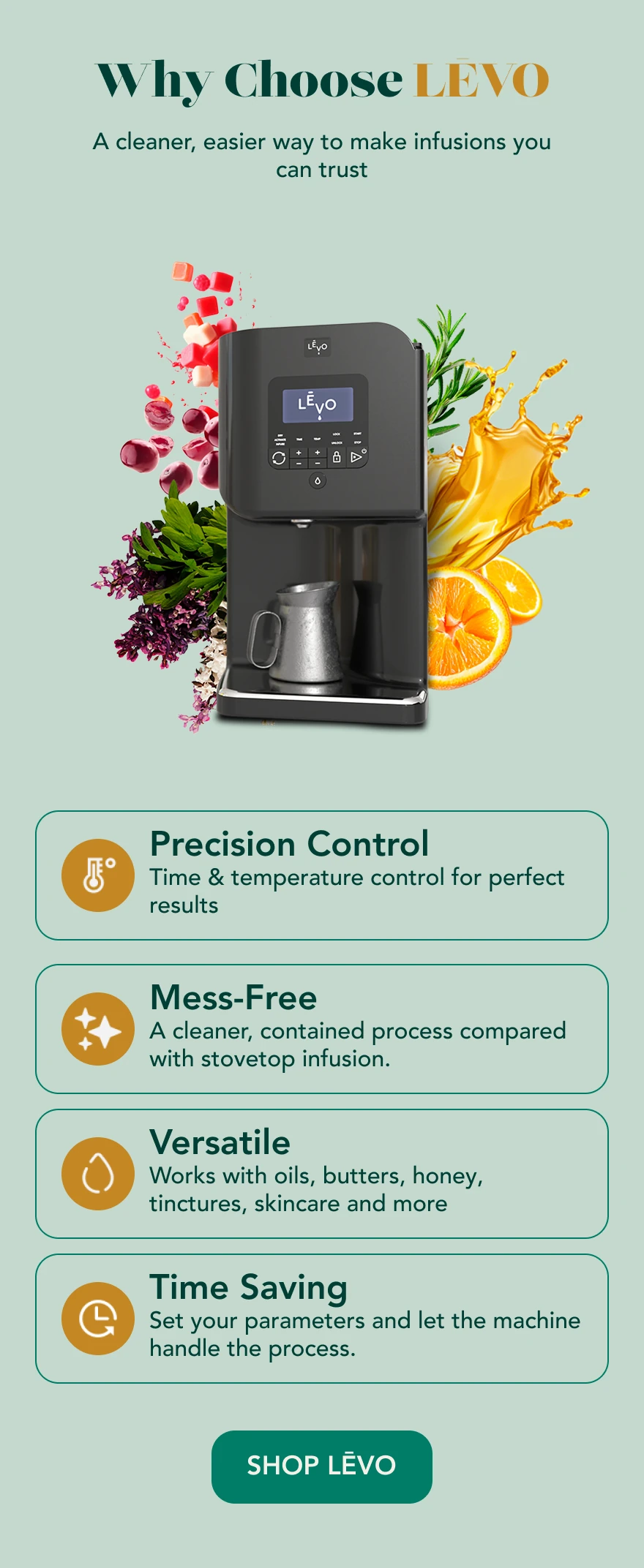
Mobile — the composition leads and the four benefits stack beneath it as full-width cards.
06 · From concept to prototype
The homepage, built.
The homepage moved beyond Figma into a functional Shopify prototype, running with the store’s products and navigation. The prototype stage refined it: “How it works” now comes before “Why Choose LĒVO,” the hero’s callouts became a checklist of what the machine makes, and the “What can you make” tiles gained short descriptions and links to shop. The collection page and the other designs remained at the concept stage.
Shopify prototype.
-
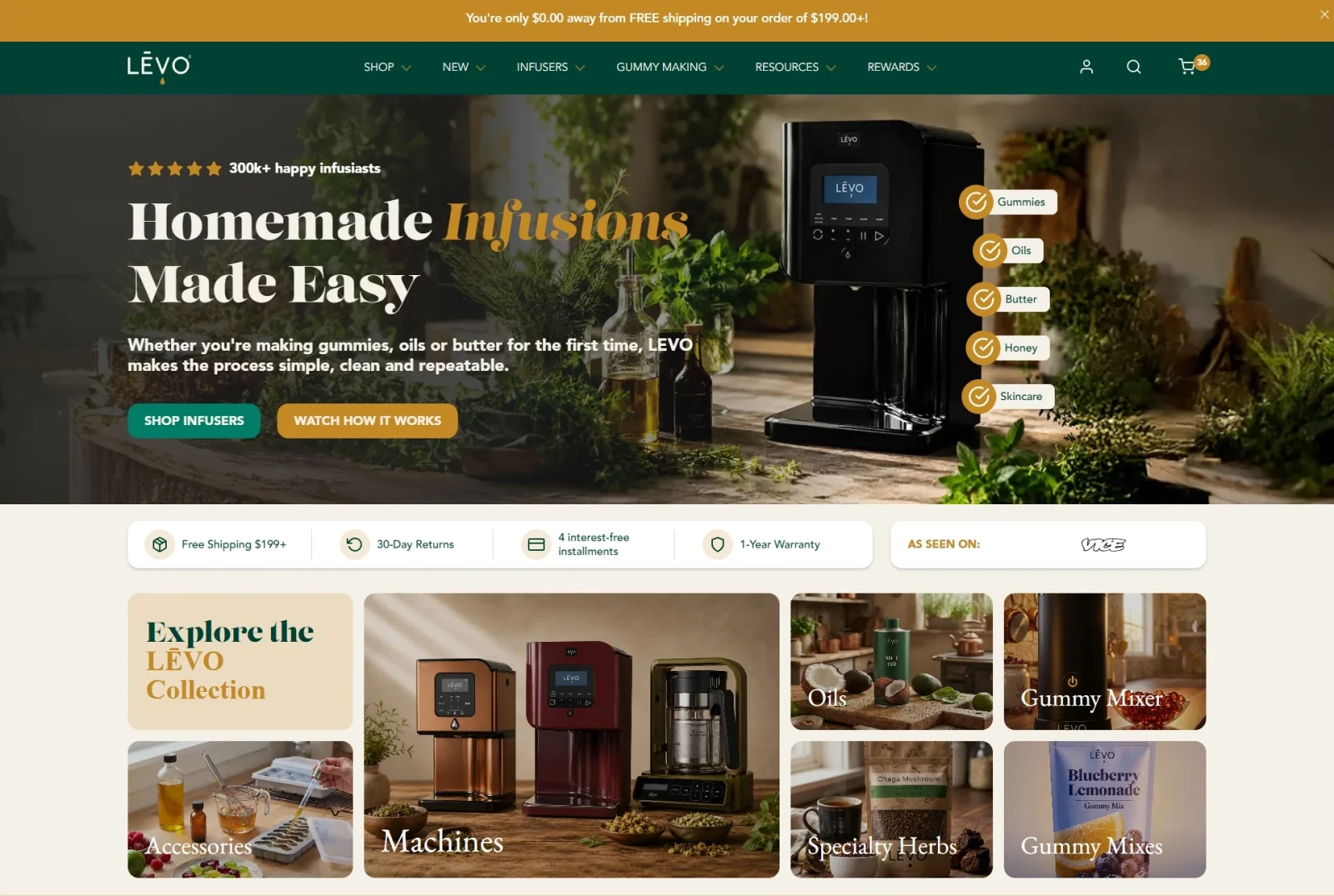
Shopify prototype screenshot (July 2026) — the homepage running as a functional theme. Not a Figma design.
07 · Key takeaway
Possibility first, then clarity.
The brand already had a strong identity and a capable product. My contribution was a direction for how they meet the shopper: lead with what people can make, then make choosing simple. Art direction creates the invitation, UX thinking makes the decision easier, and knowing how a Shopify store is built keeps both grounded in what a real store can support.