
Infused by LEVO
A cannabinoid gummy store where fruit, color and motion carry the brand and the product stays in charge — conceived, designed and built from creative direction to production.
- Client
- Infused by LEVO
- Role
- Art Direction, UX/UI Design, Full-Stack Development
Introduction
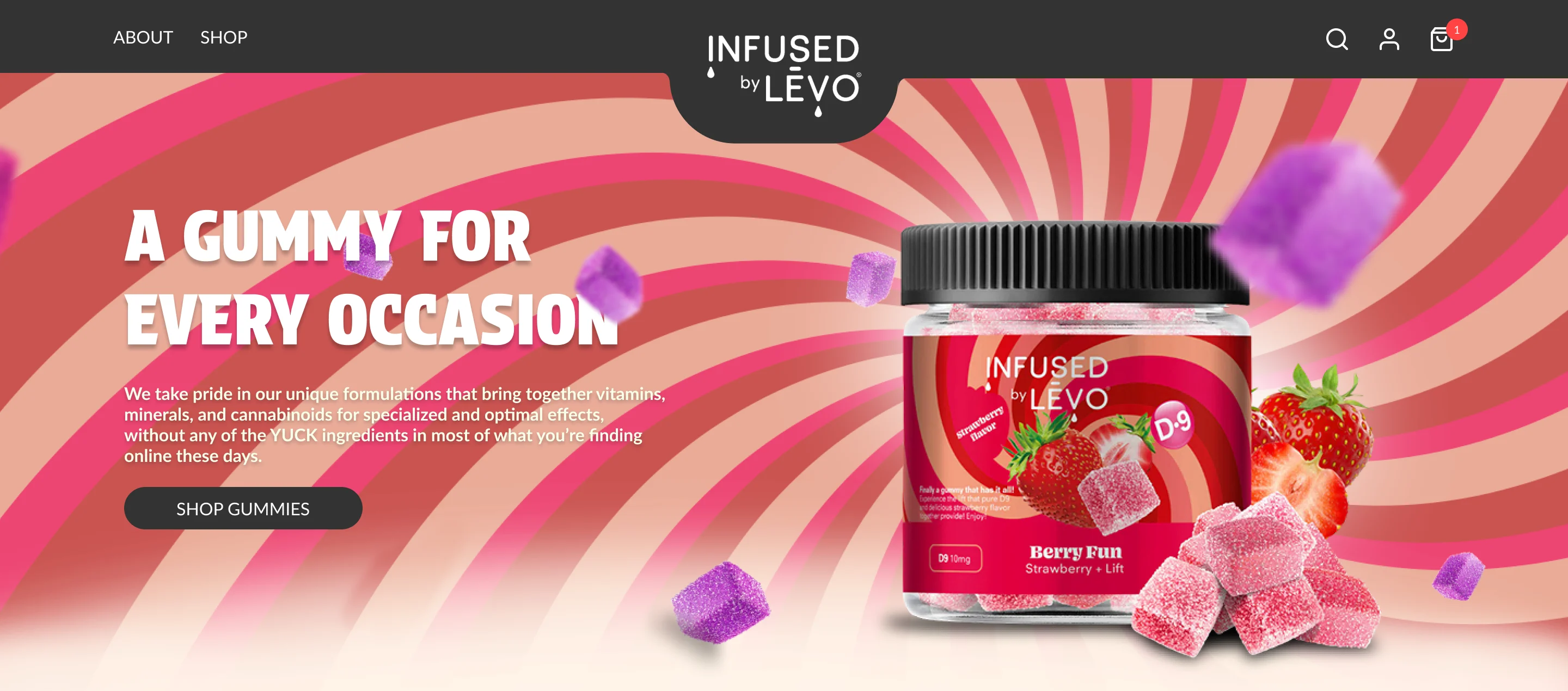
Infused by LEVO sells cannabinoid-infused gummies online. I conceived, designed and built its store — the creative concept and Photoshop compositions, the UX/UI in Figma, the motion and interaction design, and the Shopify front end and back end.
My contribution
- Visual design
- Lead designer
- Front-end
- Lead developer
- Back-end & systems
- Lead developer
Creative concept, visual design, motion & interaction design, front-end and back-end development. Brand identity, packaging and products belong to the client.
With Delivered for a client of The Limitless Agency
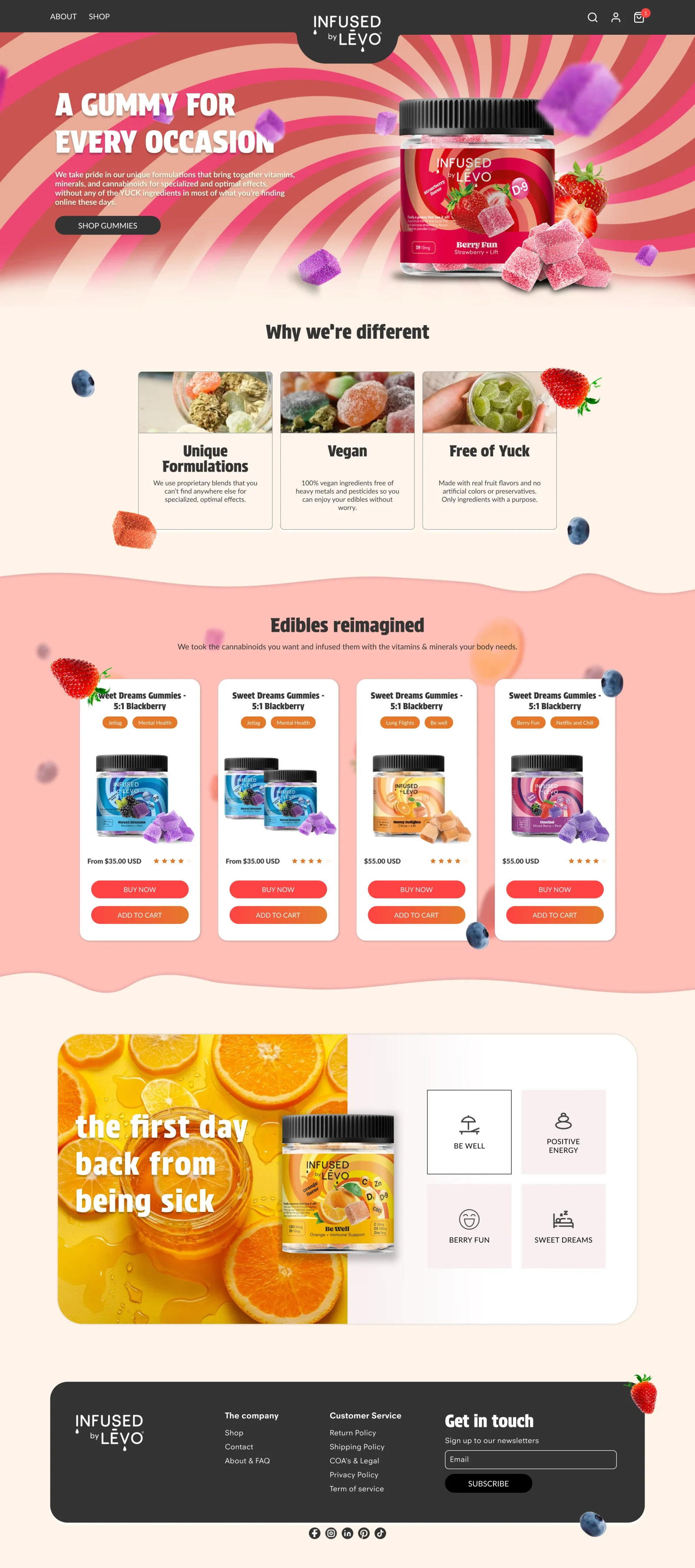
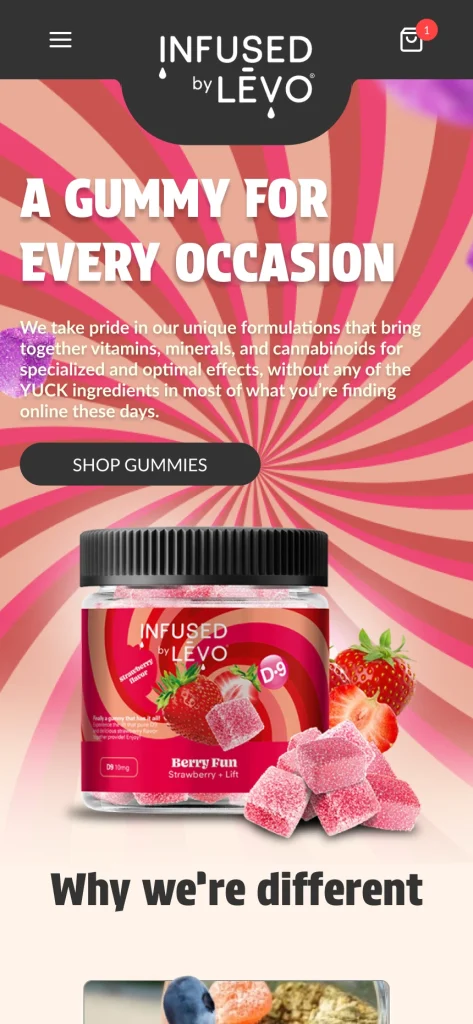
Responsive experience
01 · The challenge
Bright, honest, easy to shop.
Cannabinoid products carry visual codes that can easily take over a brand — and a technical vocabulary of ratios and cannabinoid names that is a hard place for most shoppers to start.
I set out to build a store where flavor sets the tone while product information stays complete and easy to find. The brand could feel approachable without obscuring what is in each jar, including formulations that contain CBN.
02 · The creative idea
Let the flavor lead.
Shoppers recognize a strawberry before they recognize a formulation. So I built the visual world from what is inside each product — fruit, color and texture — so every flavor explains its jar.
That one idea gave every later decision a reason: palette, composition, motion and even navigation.
03 · Art direction
Composed around the product.
A bold visual world can bury the thing being sold, so every expressive choice also points back to the product.
-
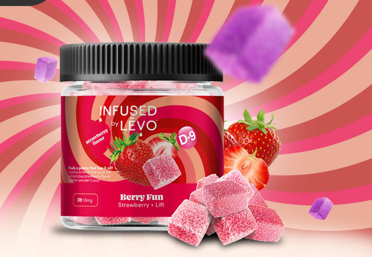
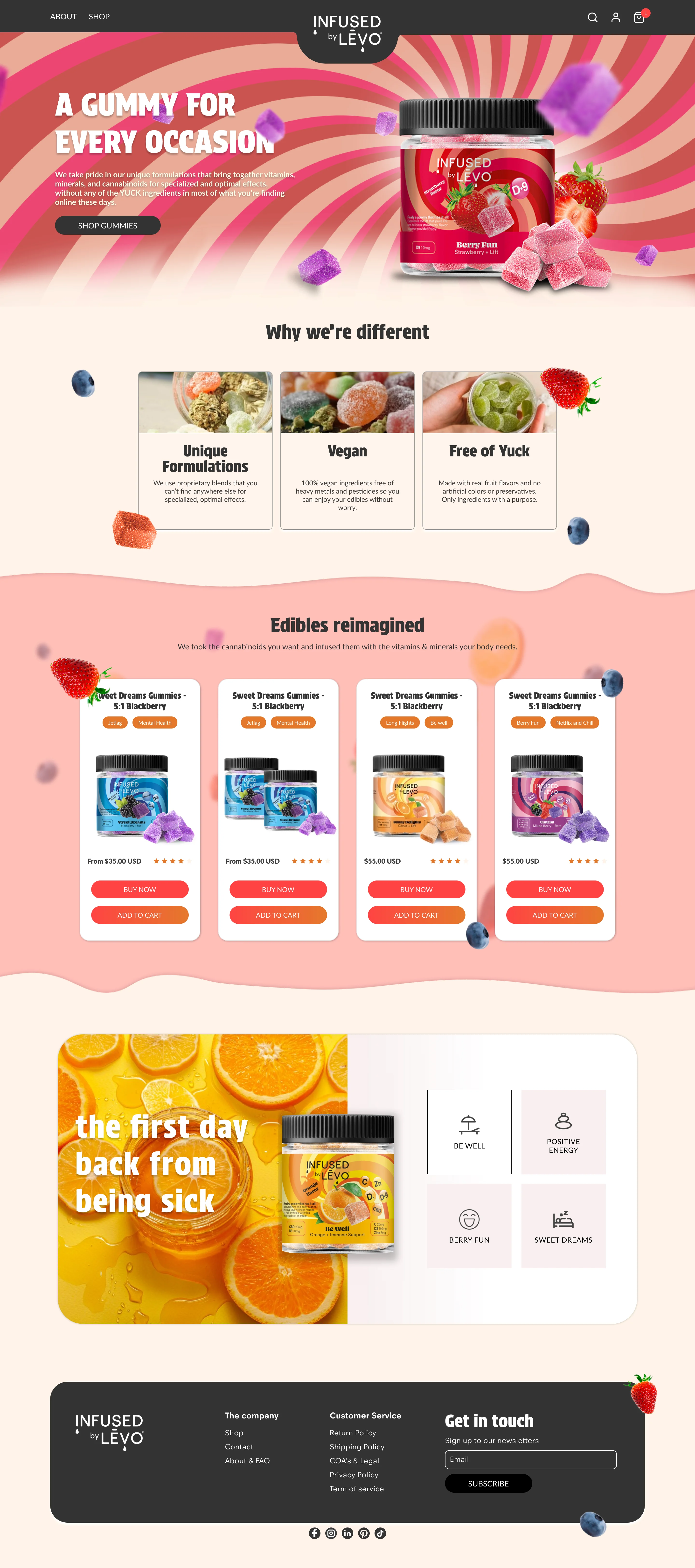
Every line leads to the jar. Stripes radiate from behind the packaging; the headline and call to action sit left, the product right. -
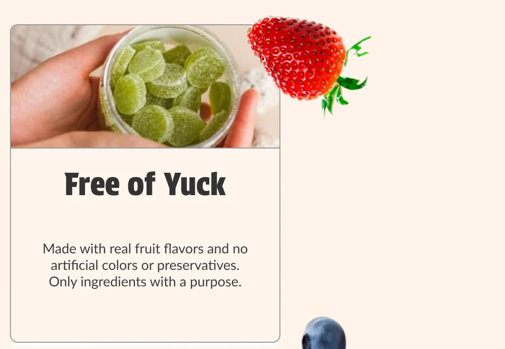
Ingredients break the frame. Fruit and gummies cross card edges, wave dividers and the footer, so the page reads as one continuous scene. -
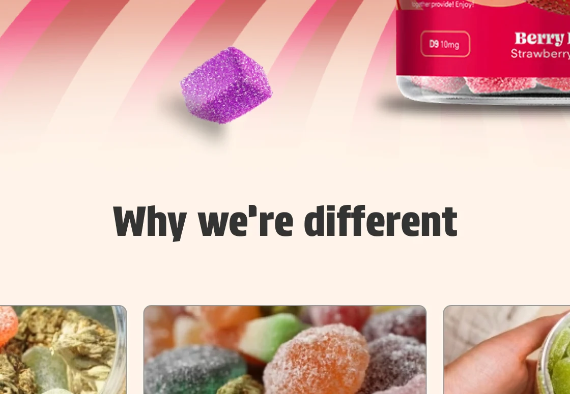
Calm between loud moments. “Why we’re different” switches to a cream ground, outlined cards and real ingredient photography — a place to read before the catalog.
Color follows flavor.
Berry
The hero’s radial field and the strawberry red that anchors it.
-
Berry pink
#E84474 -
Stripe red
#CA5350 -
Peach
#EAAB98 -
Strawberry
#D00204
Citrus & ground
Citrus warmth for its formulations, a cream ground for reading, blueberry as the cool counterpoint.
-
Citrus
#FEBF1E -
Orange
#F18929 -
Cream
#FFF4E9 -
Blueberry
#3D526F
Sampled from the original Photoshop compositions.
04 · Interactive discovery
Discover by feeling.
Starting from cannabinoid names asks shoppers to decode a formula before they find something they like. I designed the entry point around everyday moments instead: four illustrated options — Be well, Positive energy, Berry fun and Sweet dreams — each tied to a scene, from walking the dog on a Sunday to blackout shades.
Choosing one rewrites the headline, swaps the photograph and brings the matching formulation forward. Occasion, image and product change together, so the link between them is never lost — and the full product details stay one click away. It is a way to explore the catalog, not advice about effects.
One choice, three changes — the original four states.
-
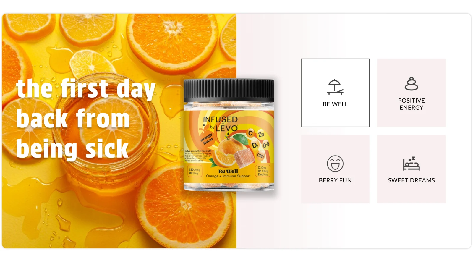
Be well → “The first day back from being sick.” Be Well, orange. -
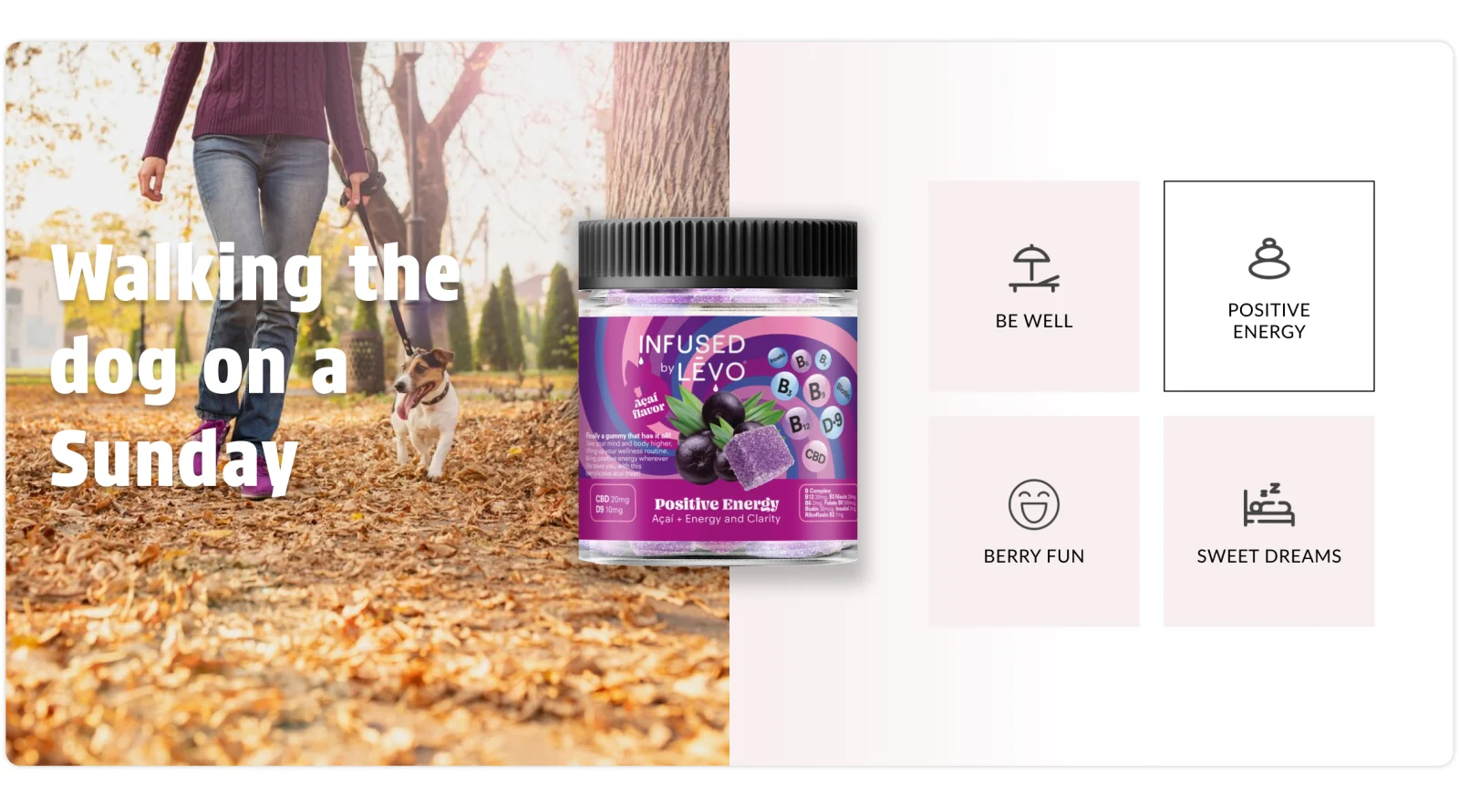
Positive energy → “Walking the dog on a Sunday.” Positive Energy, açaí. -
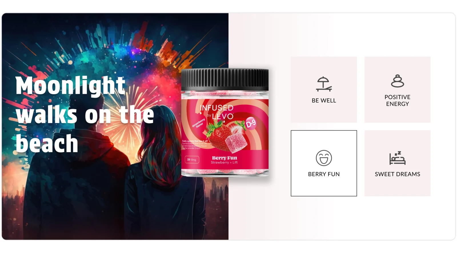
Berry fun → “Moonlight walks on the beach.” Berry Fun, strawberry. -
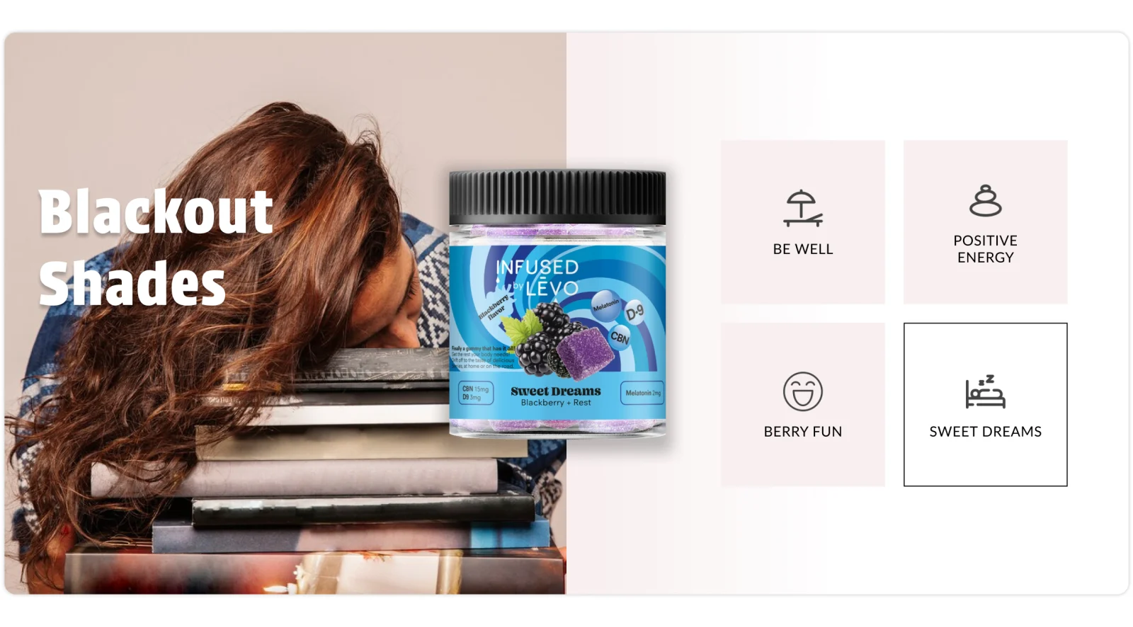
Sweet dreams → “Blackout shades.” Sweet Dreams, blackberry.
From discovery to purchase.
-
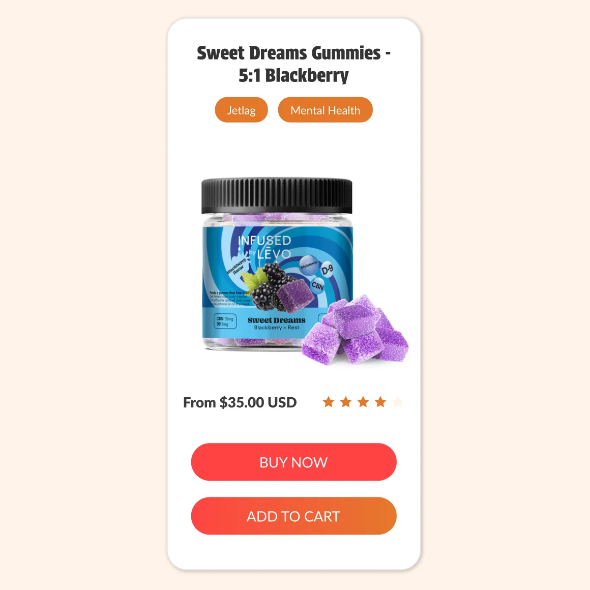
Product card — two actions for two intents. -
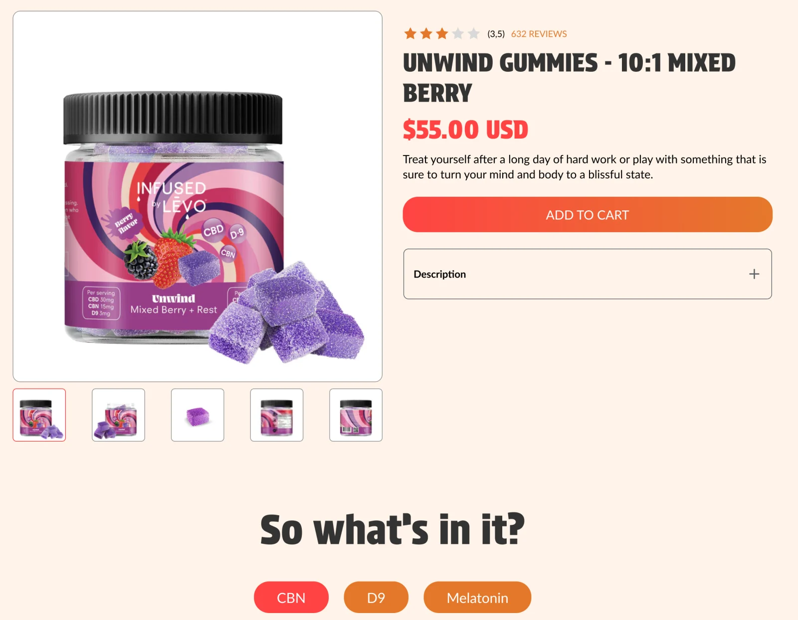
Product page — purchase first, ingredient details one tab away.
Desktop & mobile
One composition, two layouts.
On mobile the composition is re-ordered rather than shrunk: the three reasons to believe move from a row into a single column, each card keeping its photograph — and the fruit still breaks the frame.
-
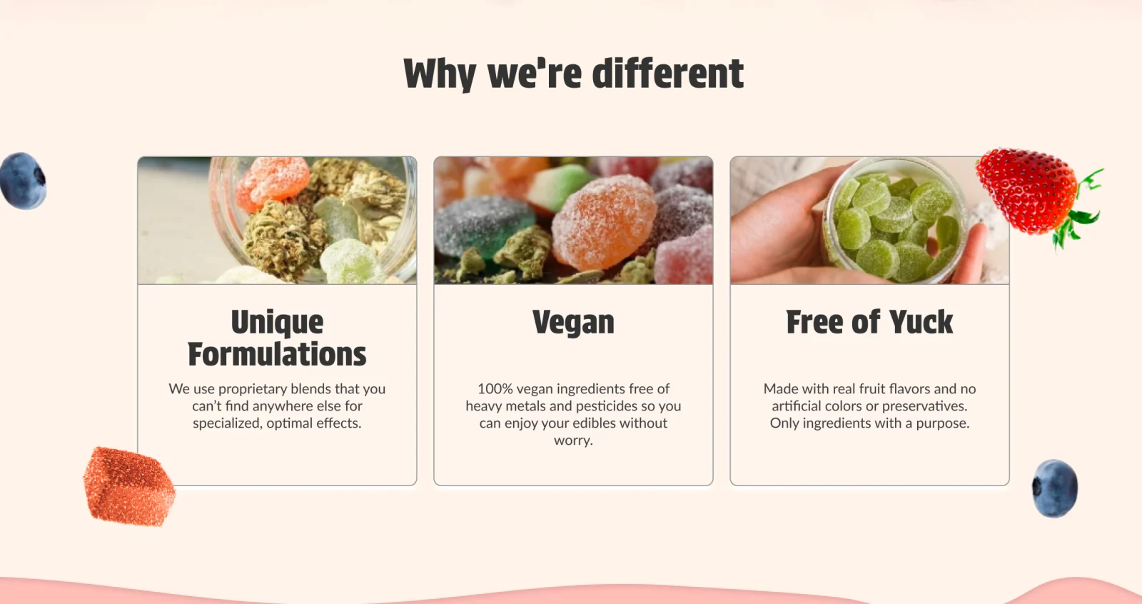
Desktop — three reasons to believe in a row. -
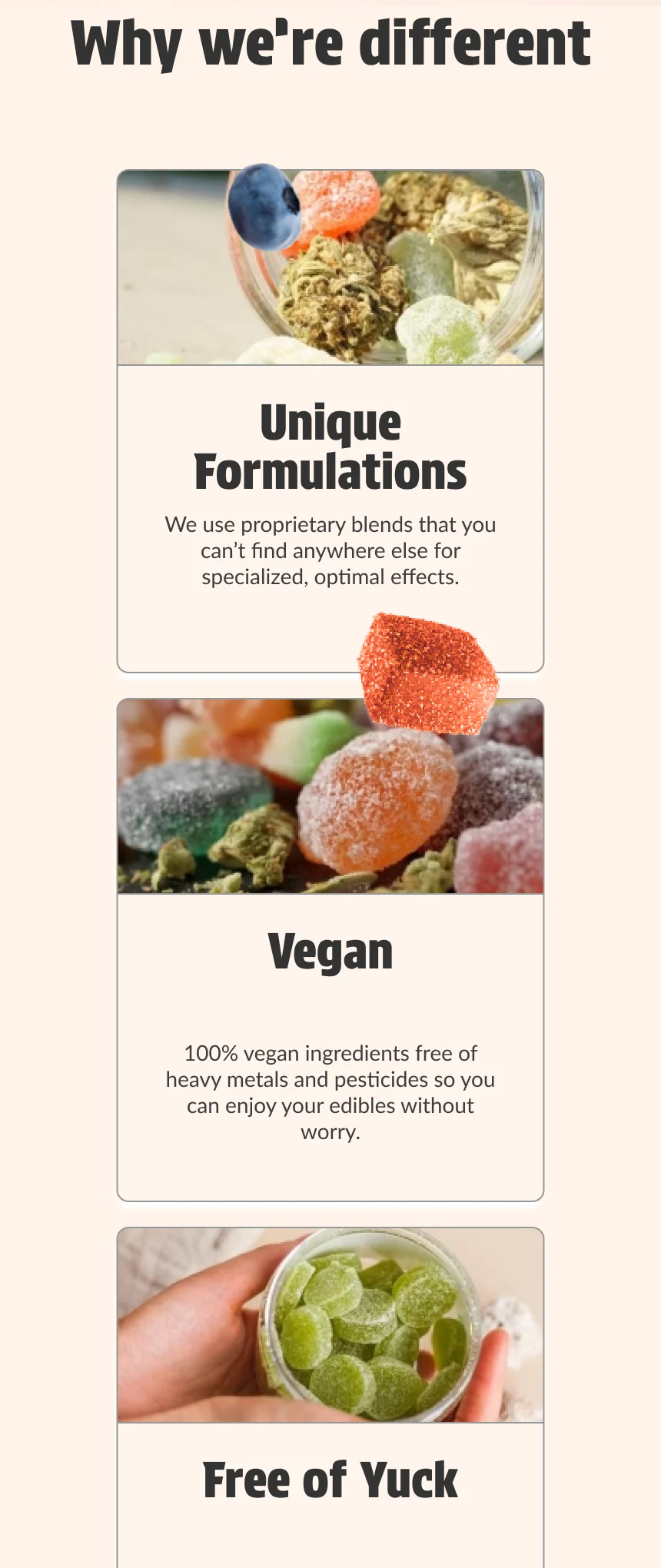
Mobile — a single column; the fruit still breaks the frame.
05 · Motion
Designed to move.
A static layout would have pinned the ingredients back inside the frame they were designed to escape. So I planned the depth in Photoshop as separate layers — a radial field, sharp fruit and out-of-focus fruit — and gave each one a behavior.
In the catalog, fruit drifts at three different scroll speeds. As “Why we’re different” reaches the center of the screen, its fruit gathers, scales down and turns; a slow, continuous rotation keeps them from ever sitting still.
Scrolling becomes part of the composition: the page gains depth without adding a single element.
Depth was designed before it was animated.
-
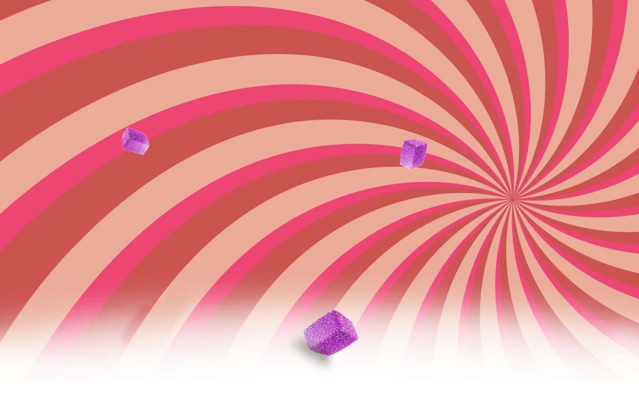
Layer 1 — the radial field that points every line toward the product. -
Layer 2 — out-of-focus fruit for the background plane. -
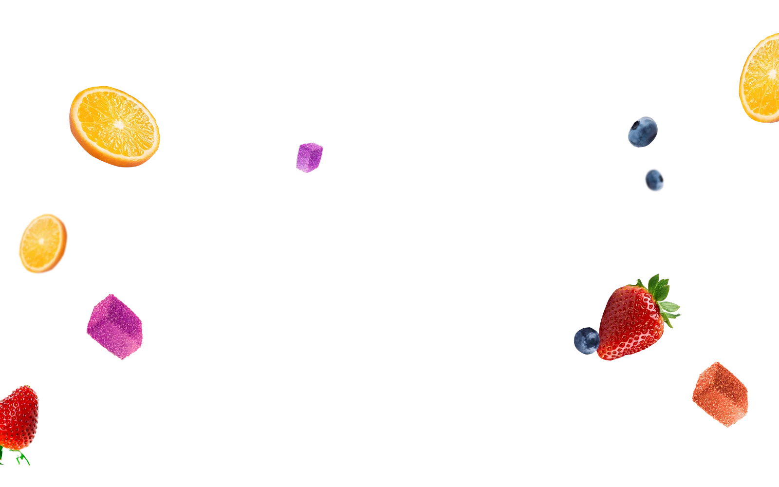
Layer 3 — sharp fruit for the foreground plane.
06 · From design to code
From composition to production.
Interactions described in a static file tend to lose their timing, distances and easing on the way to production. I built the storefront myself on Shopify — extending its Dawn foundation with custom sections and components for discovery and motion — translating each layer and interaction from the design into code.
One value drives the motion: how close the section is to the center of the screen. Position, scale and rotation all read from it, so the movement stays in proportion at any screen size.
// Why section — published theme script (formatted excerpt)
const progress = 1 - Math.min(Math.abs(distanceFromCenter / (innerHeight / 2)), 1);

elements.forEach((el, index) => {
  const toCenterX = maxToCenterX * progress * 0.25;
  const toCenterY = maxToCenterY * progress * 0.25;
  const scale = 1.2 - progress * 0.2;
  const rotation = progress * (10 + index * 10);
  el.style.transform =
    `translate(${toCenterX}px, ${toCenterY}px) scale(${scale}) rotate(${rotation}deg)`;
});
Closing
Where design and code meet.
Working across design and development let me carry this creative vision from the first composition to the live store. Knowing how to build it doesn’t narrow what I design — it widens what I can propose.