
2023 Brand Redesign
Artefolk Mística
A brand redesign that repositioned Artefolk for a holistic offering — and the e-commerce experience built on the new identity.
- Client
- Artefolk Mística
- Year
- 2023
- Role
- Brand Designer, Art Director, Web Designer, Frontend & Backend Developer
- Disciplines
- Art Direction, Backend Development, Brand Identity, E-commerce, Frontend Development, Web Design
- Live site
- artefolk.cl (opens in a new tab)
Original identity
Repositioning
From handcrafted complements to a focused holistic offering.
New identity · 2023
My contribution
- Visual design
- Lead designer
- Front-end
- Lead developer
- Back-end & systems
- Lead developer
Brand identity redesign · Visual symbolism · Typography and color direction · Brand guidelines · Photographic art direction · Web design · Frontend development · Backend development.
01 · The original identity
A brand ready to evolve.
Artefolk originally expressed its personality through a colorful feather, handcrafted typography and an expressive visual identity.
As its product offering evolved, the brand needed a more focused visual language that better reflected its holistic direction.
02 · The design challenge
Changing the visual language, not just the logo.
The challenge was to develop an identity that communicated harmony, nature and personal well-being while moving away from the visual conventions commonly associated with mystical products.
The redesign needed to establish a consistent language that could work across brand applications, photography and digital commerce.
03 · The new identity
Finding harmony through symbolism.
The new identity introduced a symbolic visual system inspired by the lunar cycle and the Flower of Venus.
Its typography, proportions, secondary marks and color applications were documented to preserve consistency across different contexts.
-
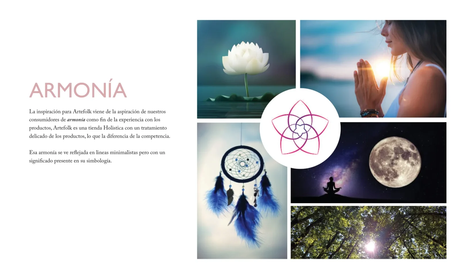
Brandbook: concept: harmony. Moodboard around the flower of Venus. Stock reference imagery used in the brandbook to define the direction — not produced for the brand. -
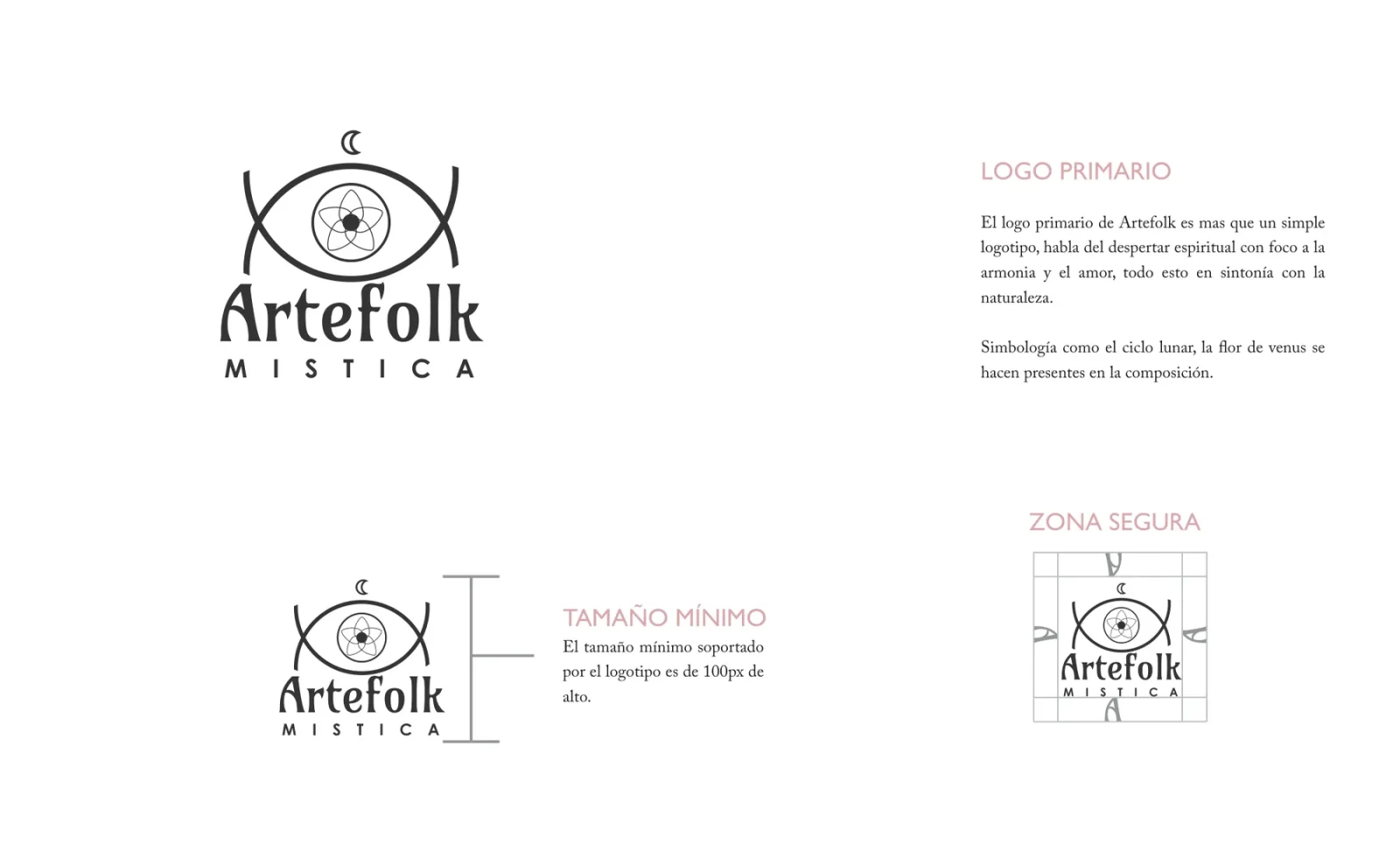
Primary logo, minimum size (100px high) and safe zone. -
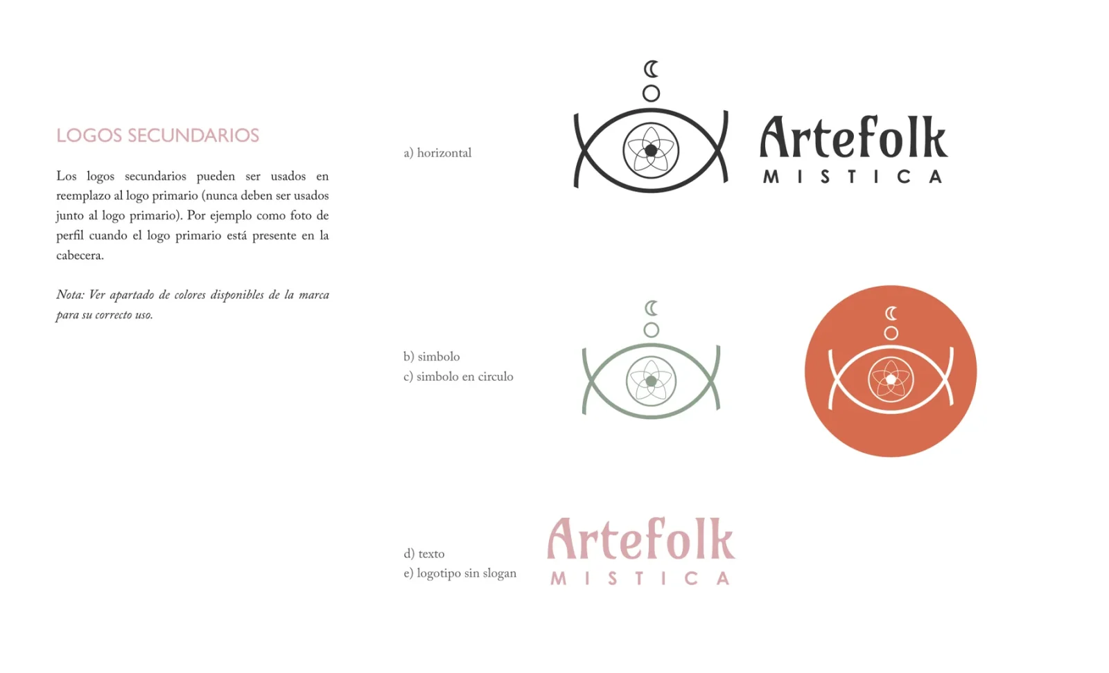
Secondary marks: horizontal, symbol, symbol in a circle, wordmark, logo without tagline. -
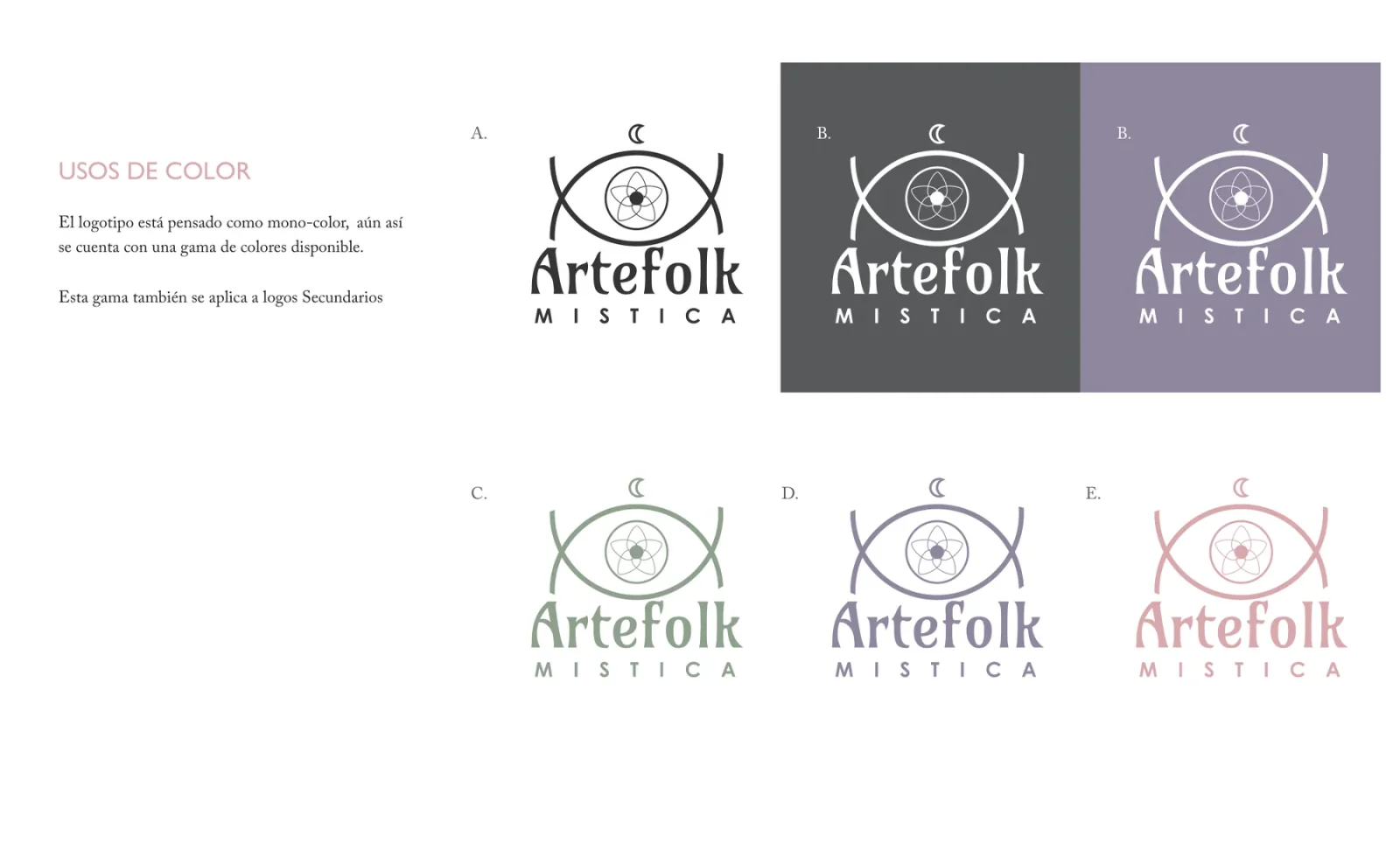
Colour applications of the single-colour mark. -
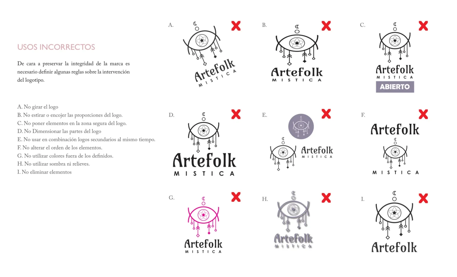
Incorrect uses: no rotating, distorting, recolouring, effects or mixing marks. -
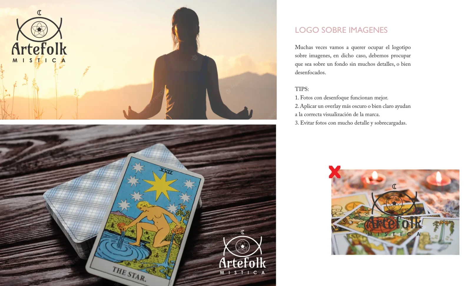
Brandbook: logo over images: calm or blurred backgrounds, overlays when needed. Stock reference imagery used in the brandbook to define the direction — not produced for the brand.
04 · Art direction
A visual language beyond the logo.
The brand identity extended into typography, color and photographic direction.
Soft greens, muted purples and warm tones were selected to support a natural, approachable expression. Titles use Playfair Display and text uses Poppins — both Google Fonts, chosen for an easy move to digital — with #333 in place of pure black.
The photographic guidelines favored authentic situations, natural light and contextual product presentation over forced poses, dark mystical stereotypes or excessively artificial effects.
Documented palettes
Primary
Backgrounds for communications, large titles, information banners.
-
#C8D3B5 -
#C1B3D5 -
#EFCCB9
Secondary
Combined with the primary palette or on its own, for depth and points of interest.
-
#8C9E8B -
#8E849C -
#D7A6AA
Values as documented in the 2023 brandbook.
Guidelines — typography and photography
-
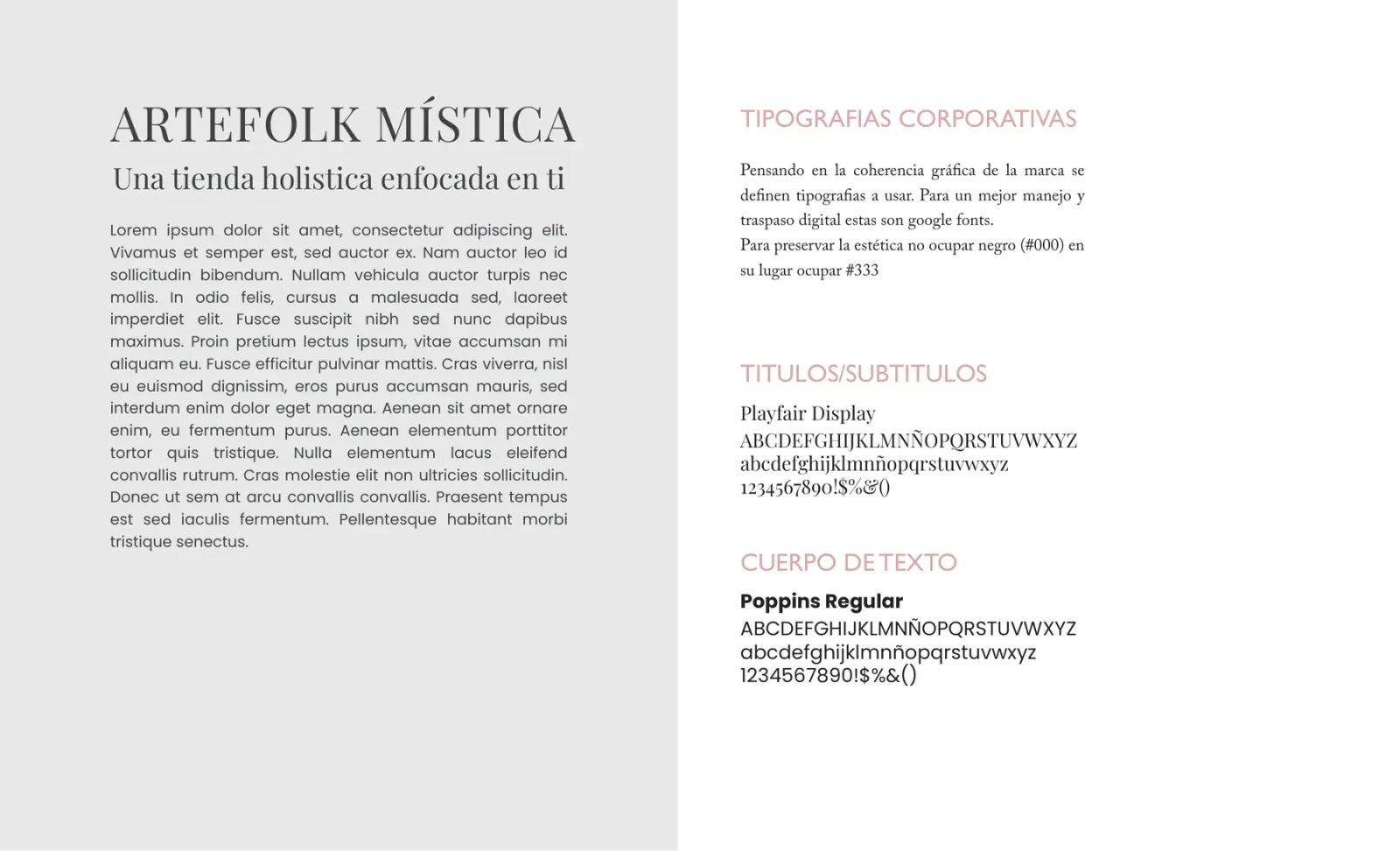
Typography: Playfair Display and Poppins; #333 instead of pure black. -
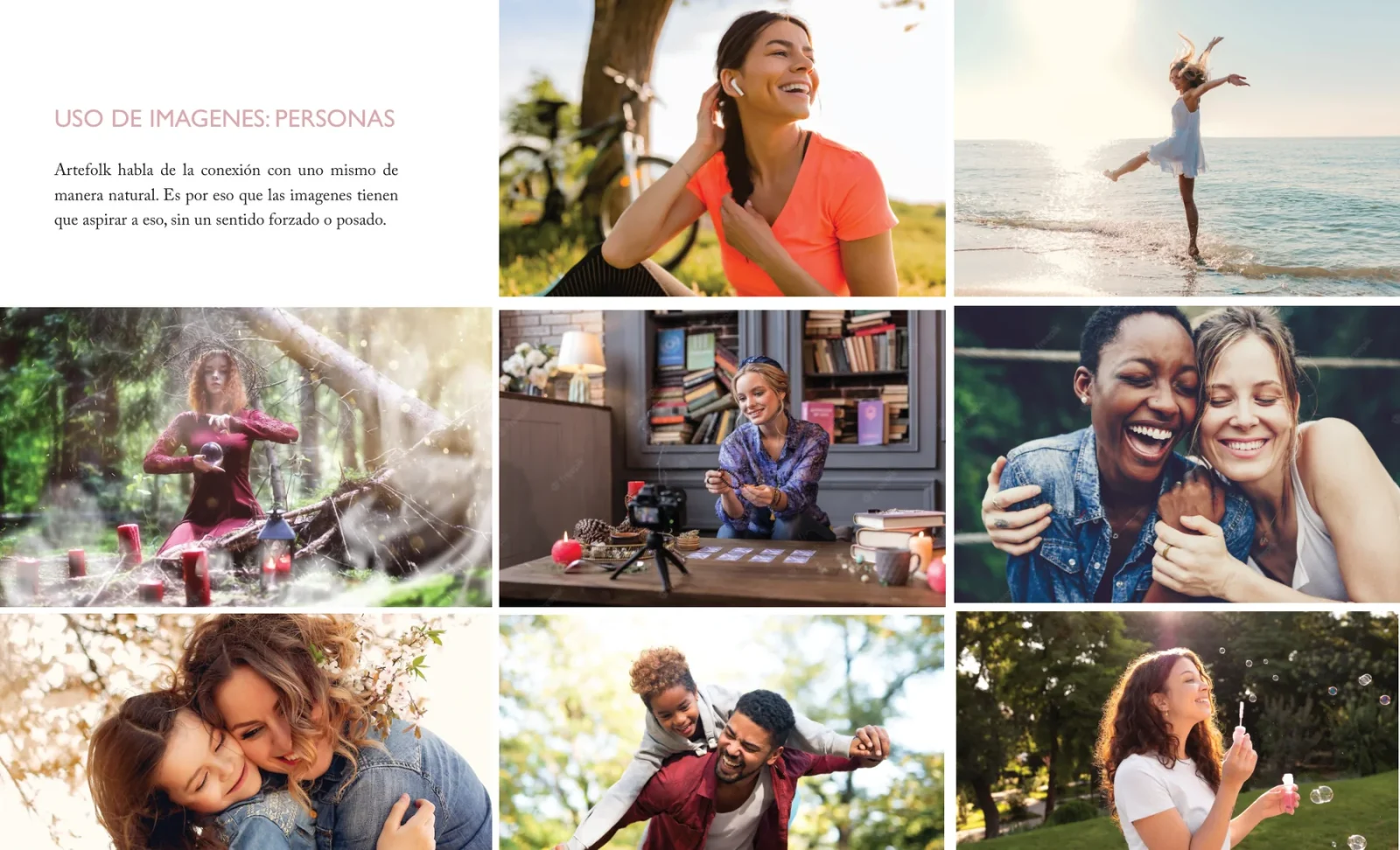
Brandbook: photography of people: natural and unposed. Stock reference imagery used in the brandbook to define the direction — not produced for the brand. -
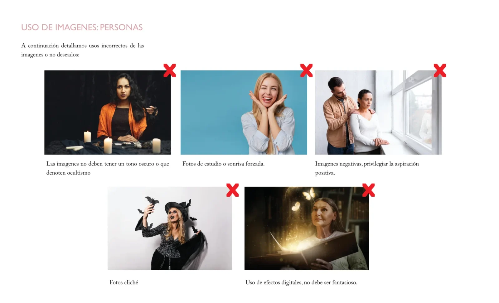
Brandbook: to avoid: dark or occult tones, clichés, studio shots and forced smiles, fantasy effects. Stock reference imagery used in the brandbook to define the direction — not produced for the brand. -
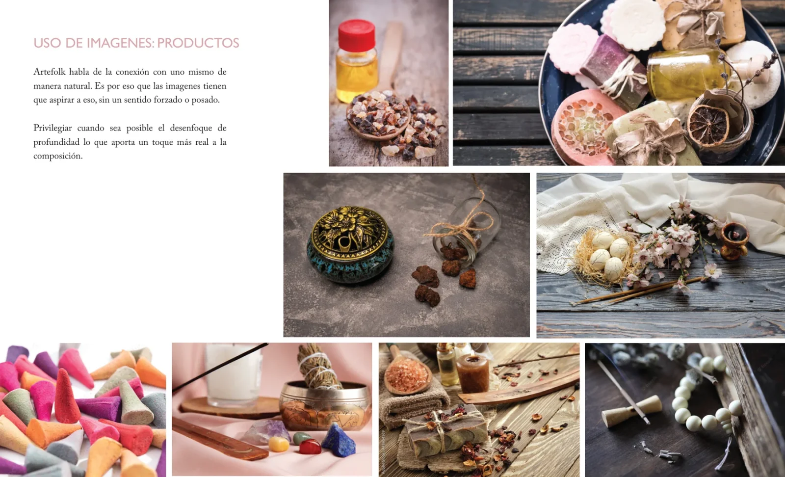
Brandbook: products in real settings, with shallow depth of field. Stock reference imagery used in the brandbook to define the direction — not produced for the brand.
05 · From brand to ecommerce
Bringing the identity into the shopping experience.
The redesigned identity became the foundation for Artefolk’s digital commerce experience.
I translated the visual system into a responsive storefront, integrating brand communication, product discovery and ecommerce functionality.
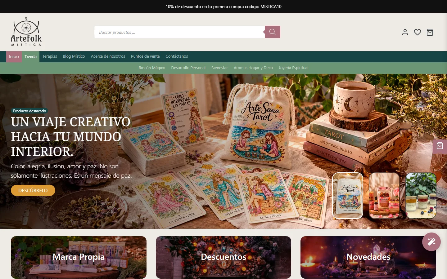
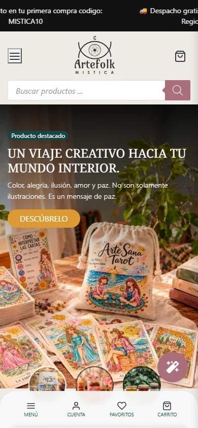
-
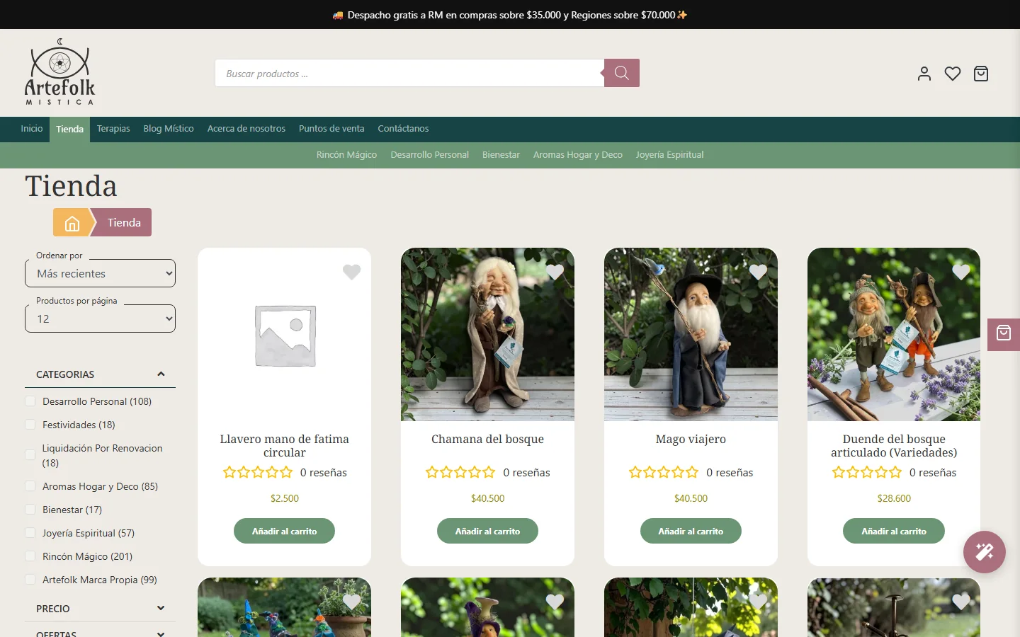
Product listing with category filters. -
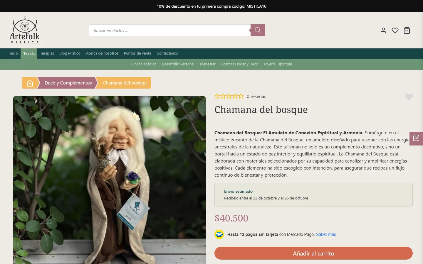
Product detail page — product photography as published in the store. -
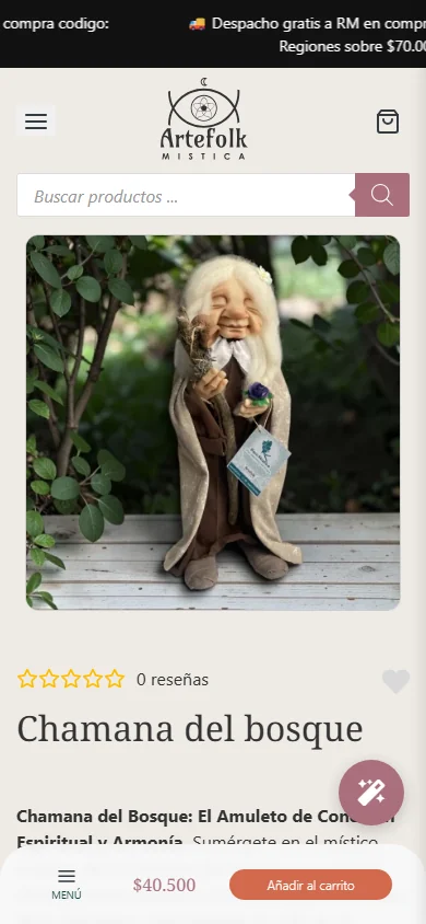
Product page — mobile.
06 · Development
Design and technology working together.
Beyond the visual design, I implemented the ecommerce experience with WordPress and WooCommerce: a custom theme, and custom plugins for the store’s operational needs — checkout improvements with a shipping estimate, a Paket shipping integration, a guard for international checkouts, a rule that limits PayPal to international orders, and structured-data generation for products.